5 Lessons For Your Next Proposal Layout From UK Party General Election 2015 Manifesto Designs

The UK’s marathon election campaign is over. We’re not used to six-week slogs here.
I thought I’d look at each national party’s published sales doc; their manifesto.
I was surprised at the general level of inattention to ‘presentation’. For instance, only one (UKIP) considered landscape. Overall, crispness and punch were often disregarded in favour of block upon block of unbroken prose.
So I thought I’d rather try and be positive. And highlight five tactics that we can embrace for our own winning Proposal.
Title
Let’s start with that simplest of act. Naming our precious Prop. Here’s the five pdf file titles as downloaded direct from each website:
UKIPManifesto2015
Green_Party_2015_General_Election_Manifesto
Liberal_Democrat_General_Election_Manifesto_2015
ConservativeManifesto2015
BritainCanBeBetter-TheLabourPartyManifesto2015
Ew. First up, what’swithallthenospaces_and_underscores_?
Second, only Labour use the power of sloganising here. Which we should also do. Albeit not with their generic phrasing. Every Prop should be entitled by our unique (shared) term for the problem the prospect seeks to fix.
Front Cover
This is a topic I’ve blogged on before. Most recently at the start of the year through charity best-practice.
Sadly, none of the parties seem to have fully thought this through.
Scarily cluttered, school-photo-feel or single brand-colour emblazoned with disjointed word-cloud mark down three.
![]()
And a fourth sports only large plain text in two-sentence, twenty-two word guff, atop the title. None nail it.
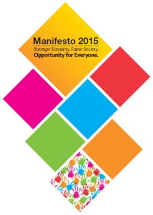
Then there’s the LibDems. Their direction can work. They choose seven swivelled squares. Five feature what amounts to an exec summary with white fonted snippets. It’s not perfect, but they’ve realised something that doesn’t look like the opponent’s tired attempt can thrive. (My pic here redacts that white text and their logo from top-right.) And what about that bottom rhombus. Go art…
Your formal cover is important. It should be more (all) them, and (way) less you.
Structure
Thankfully only one party (UKIP) stuck closely to sections split according to the (21) cabinet ministerial badges. It sadly reminded me of all those business plans I’d read that blindly reproduce template software headings.
Anything that moves beyond this is a winner. And the rest give it a decent stab.
The problem comes when these are heralded by the kind of business-babble of the buzzword bingo sheet.
A better future for Britain
Jobs for all
An opportunity society
Putting the social back into security
Indistinct. Bland. Meaningless.
Each comes from one of the better quartet. Guess in which order? Probably not, and that’s the point.
Even dutifully following the prescribed rubric of an official tender doc, there’ll likely be opportunity (and need) for you to provide a more ‘digestible’ document. One where ‘ticks-in-boxes’, ‘techs-and-specs’, ‘speeds-and-feeds’ give way to your preferred promotion of compelling business case. Make style and substance join forces.
One further point I’d make on format is the use of the Foreward.
Most businesses understand the need for an Exec Summary.
(Long ago I even blogged on doing this a la the Twitter via Elance stipulations.)
Imagine the impact of a succinct, snappy and sincere paragraph or two from your chief exec. When properly involved and zoned in on your prospect they could be dynamite for you.
Emphasis
No-one buys line above line of text. Yes, it may still get read (it’s a law of procurement). But just because you swap sentences for bullets, and colour-in, italicise or embolden brief segments does not magically transform it from a scramble of characters.
Text needs breaking up. You’re not writing a novel.
You can mix up the columns of text flow, as well as place summary boxes and its ilk in and around it.
UKIP did try this, but their look was messy. Too much going on. Labour, who went for total text, did at least come up with end-of-chapter summaries. A kind of traditional report writer’s ‘recommendations’ vibe delivered in a “Labour will…” pledge manner.
The Conservatives upfront centred text page summaries were useful. Although the same styling didn’t quite hit the mark for their “Conclusion”. Yet they showed the neatest example of pulling out highlighted content (small print pixelated):

But far too much stock photography nonsense across their tome for my liking. You simply must make pictures count.
Graphics
In fairness, dodgy imagery afflicted all the players.
At least UKIP attempted to make slides of theirs. But riddled them with tiny text. How about this for a touch of photoshopping?
Nice idea, poor execution. A metaphor, anyone?
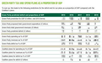
They also tabulated some numbers. Some. The one area the Greens stood out was in their aim of providing lots of figures. In fact, they went over the top with their financial tables. Not great presentation. Not a single graph for instance.
We must put in the money. Do not present it like an invoice.
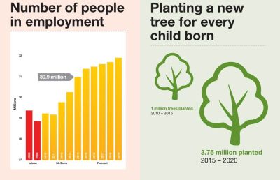
Then we come to the Liberal Democrats. Funky infographs aplenty.
Strangely all but a couple sat well. One with a flipped doomsday clock image was a shocker. At least their full page prominence aided the flow.
You. Must. Use. Good. Graphs.
And so.
Labour may score on academic elegance. The Conservatives spent more on looking the slickest. But when it comes to abiding impression, I just couldn’t shake the solitary piece of art adorning one set of ‘inside covers’ from my mind.
Look back up to the top of my post. Relevant? Hardly. Meaning? Doubtful. Recall? Share? Like? Well, yes…!