Do You Use A Flip Chart Like TV Oxford Professor?
Lewis. How lucky we were that Morse changed the telly detective game.
So in a sofagrab of downtime I watched the episode Generation of Vipers.
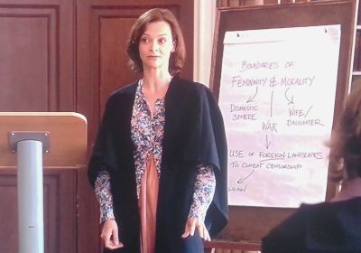
The ‘lonely feminist lecturer’ pictured above was its first murder victim. Miranda Thornton (played by Julie Cox) was a professor at Oxford. Here she’s seen leading her class discussion around Shakespeare’s depiction of women.
It caught my Sales eye because of the flipchart.
Where once ubiquitous blackboards have been completely replaced by the whiteboard, these tall easels with large sheets of paper pads still feature in the corner of just about every office you visit.
Even today I often find myself helping to show salespeople – spanning all ages of experience – how to properly use such kit.
There’s a slew of secret tips that open presenters’ minds.
Looking here just at the flip chart of the professor above, here’s a simple five ideas based solely on her (set dresser’s) scribbles;
Colour – There’s only one here. You always need to use at least a second. Get into the habit of carrying a few whiteboard markers in your personal carrier of choice. Know what should be in a different colour and make it stand out.
Highlighting Elements – Hierarchical lines apart, there are none here. Always use underlines, circles, arrows, stars, squiggles and glows. Preferably in another colour too. Note there’s a balance too. Less is more can apply. Be prudent in what you highlight. Not everything needs an impact mark.
Font Size – The fictional sample above is scarily accurate in that many a salesperson will think they are writing every single letter in the same size, yet the top line is always larger than the bottom. Somehow the natural tendency is for each line to get smaller as you write lower down the sheet. Better to deliberately pick out certain words and enlarge them rather than let your page look like the reverse of an eye-test chart.
Orientation – This example also shows a classic top-down approach. Almost every single person presenting this way does so. It’s so simple to stand out by mixing it up. Be memorable by starting from the bottom and moving upwards sometimes. Or from the side and going across the page.
Conclusion – Finally, what’s here is like a list of reasons. When you present, what is your real point? If someone walked into the room after and saw the pad, what would you want them to instantly see? Is there either a conclusion they’d notice or something that’d make them ask a question of your audience?