Even The Donald Has His Charts At Hand
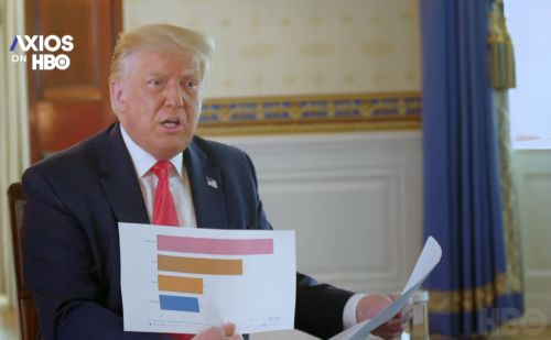
The latest interview with US President Donald Trump doesn’t disappoint. It duly sends salivating memesters wild.
What is noteworthy, is that each of the three graphs he showed during this one were accurate.
Whether they show the ‘best’ data is perhaps another question.
Yet the country comparisons are notoriously tricky. Both ‘sides’ – that is in this case, pro- and anti-Trumpers – sadly fall down this trap with their preferred measures. Even the much-touted “gold standard” of “total excess deaths” may not be as shiny as it seems.
With the four bars above, the strapline that accompanied ran as follows;
“we’re last, meaning we’re first, we’re the best”.
There is a certain touch of pitch genius to this.
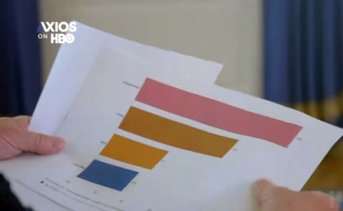
What’s also good – leaving aside the potential glitch of four different colours (at least they’re not primary hues) – is how visual this chart actually is.
Simple, stark, succinct.
A stance regrettably not extended to the other two he showed.
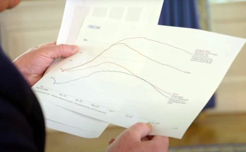

The pair of line graphs need a little editing.
In similar manner to that you always benefit from a thicker nibbed marker pen for your flipchart than you initially think.
As with the boldest of the barchart, both these could have done with trying super-wide lines. Maybe even alone for the one set of data wished to be highlighted. Even grouping the rest as a kind of area chart feel.
Bringing such printout to a meeting is an underused winner.
Even affix a sheet onto a piece of art board.
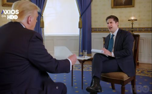
Just make sure you act if you catch your audience looking like this;