Four Ways A Volatile Mix Gives FT-Sharp Slides
The presentation sales front has particularly drawn my eye lately. This is inspired by The Financial Times. Friday, 7 March 2014. In the London print, page 12.
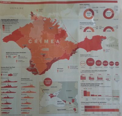
A Volatile Mix is the name of their Crimea illuminating infographic.
Adapting and remixing the professionals’ graphics is a winner for our own slides.
Especially when they can be easily replicated in Powerpoint, as these ideas can.
Let’s look first at the top-right corner. Donuts and Half-Donuts.
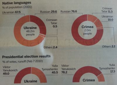
Fairly standard donuts, although they are crisp. Note how the centre is given a use.
How the half-donut can be so effective for getting across your point when there are only two variables. Powerpoint has a ‘basic shape’ ideal here; block arc. Make two and layer one on top of the other then edit the points of the top one to get exactly the same effect in a jiffy.
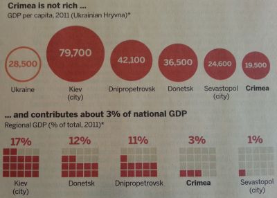
Zoom in on the circles and blocks.
Having different sized circles instead of bars is currently super-trendy. The technique has shown staying power I feel in part because you can do away with axes, so the slide looks sharp.
Then there’s the relatively recent block-pies treatment. Rather than replace a single pie, here they show how a bar chart can be bettered in this way.
The FT show a terrific twist. With none of the four values above 20%, each block is restricted to just twenty squares. I think this looks great. It’s my favourite of the quartet and I will be using myself as soon as I can.