Lies, Damned Lies & Pies
Pie charts. A victim of their own success.
In true contemporary infographic innovation, I’ve found people respond very well to pie evolution.
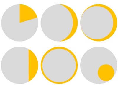
Above are six ‘pies’. The traditional is top-left.
Each one depicts the same data. An 80-20 split.
Yet you could conjure one of those annoying psyche tests out of them I reckon. Ask people to rank them in order of gold section size. Optical illusions cloud their identical reality.
You can easily chose the visual that best makes your case.
It took me an hour in powerpoint to create these half-dozen options. Next time I need them, I can adapt in a jiffy. Even stretching to an extra data set, so 80-15-5 would be a doddle.
Once I remembered my ‘pi r squared’, the trickiest part was solved by a web calculator for the circle-segment (bottom-left). The lune (crescent) also proved a touch troublesome to figure until the web helped out. And would you credit it, the circular sector (that’s the good old pie slice) is rather fiddly in Powerpoint (they only give three-quarter mode so you must edit a point accordingly and I did it manually via their hexagon as a guide). Their other shapes provided are a cinch though; segment, crescent and circles.
When I’ve had several pairs of separate data, the annulus has worked really well for me (bottom-centre). I like to compare several pairs on the same screen.
Now I have these templates, I’ll be ditching the wonderful-yet-Excel-Wizard-to-death pie more often.