MWC Slide Mobility Slowed
Last week’s Mobile World Congress (Mobile is Everything) gained its now customary wide media coverage. Although this time a little dimmed, as it strangely clashed with a big Social Media Week shindig (Reimagining Human Connectivity) from New York.
So I eagerly flicked through Instagram tags from the event hoping to eye some stellar slide action.
Above, a collage of ten blurry audience longshots of presentation graphics.
I tried to cover the gamut from worthy to worthless.
Sadly the sewered lower reaches remain densely populated.
I like relevant photos with a word or two tops. Data pics that make you think beyond the standard snorecharts. I don’t like bullets. Nor 21st Century clipart image guff.
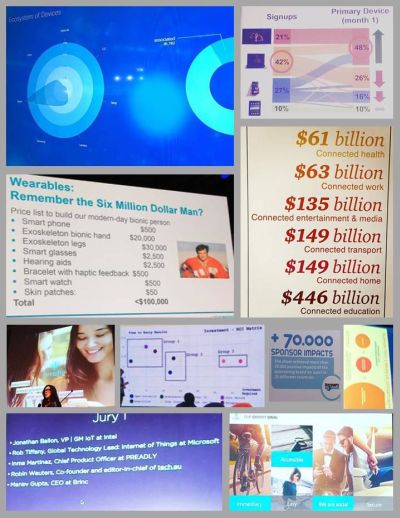
The top-right work from Netflix is worth a mention. Part of a story with Sankey-style conclusion that tv is going the way of the music industry.
Then beneath are some sector spend figures. With actual numbers. Slightly colour-coded to boot. And, quite the startler here, presented not in trad landscape, but portrait.
Why is it so? A mobile conference still has slides predominantly shining lengthways. Yes, tablets and laptops are spotted around the halls. But the vast majority of interacting seems done on phone screens. Top-to-bottom, not side-to-side orientation.
Who is designing slides to fit snugly on a smartphone browser?
4:3 and wider are great projected, but where are the messages crafted for impact through 9:16 display?
How is a vertical scroll being integrated into your imagery over swipe-left?
And don’t tell me people swivel their screens. Really.
As an experiment, I switched Powerpoint page setup to 16:9 Portrait. Then stitched a few slides together to output a long single jpeg. The standard 720 pixels across. It worked like a dream on my phone screen. And I couldn’t help thinking how different such presentation would look on a prospect phone.
And of course, you do know the phone your prospect has, right? Else cross them off your forecast, hey.
Precisely twelve months ago I recall swiping through a day of Instagram presentation slide snaps. So as an option you can always try out the default Instagram square too. Trial and close (but never trial close, right?!).