NYT Trump #FakeNews Visuals
My Boy Donald. Takes daily blows from myriad media nemeses. Including here on 23 June 2017, the New York Times. Here’s the original tweet from their graphics director of a wonderfully presented full-page opinion piece spread. Entitled Trump’s Lies, and promoted online as, “the Definitive List. We have catalogued nearly every outright lie the president has told publicly since taking the oath of office”.
My screengrab above is from the top of their web version. Improving the print edition text due to the reddened dates and more distinct blackened quote from greyed reasoning.
There’s a lot to like about the presentation. Not least because, no matter whether you may shout against/for its bias/truth, it shaped the debate for a news cycle or two.
The continual word-wrapped prose as opposed bullet listings. The simple format of date-“claim“-(“challenge“). Space left in the middle for imagery.
And it is the central area that sets the print visual apart. The way it’s framed by the “detail” is a real winner. I can definitely see a sales slide in this style. Any longitudinal data series pic with a border of quotes or chronological events written up that mean something for your audience.
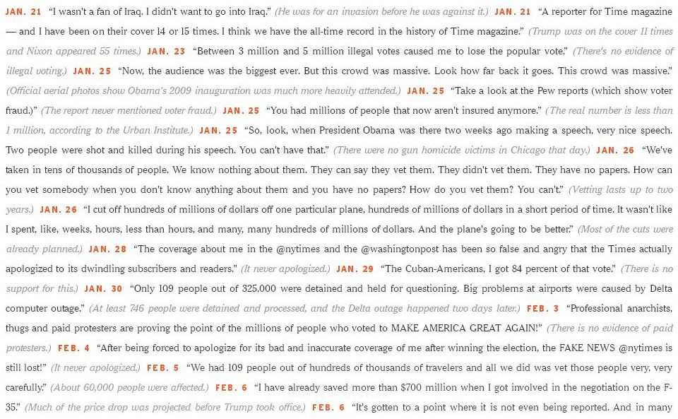
Their first image, here shorn of labelling, of chosen occurrences by calendar;

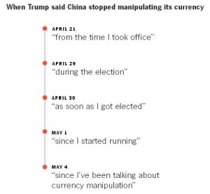
Then later there’s this kind of timeline;
I’m sure by the time I post this, rebuttals will have sprung up online (“The New York Times has never published a “definitive list” of President Barack Obama’s lies.”). Whenever, they’ll need to go some to match both the art and impact of this first-in piece. Let your infodoc-ing enjoy the same.