Paint Your Colour Name On The Prospect Palette
I caught a potted history of colour naming from a telly magazine piece.
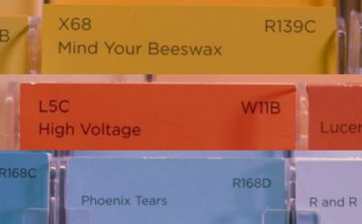
Who knew the current trend for treating colours as if they were racehorses is by some placed at the door of Crayola. Their crayons begin with standard names in 1903, yet by 1949 their range expands to such an extent that they feature thistle, cornflower and orchid.
The ‘reporter’ cited the vast number of blues in one selection, including lunar landscape, bermuda cocktail, and even cuddle.
Discussing the idea at paint maker Valspar, the intriguing ‘marmite’ angle appeared. It seems they see glory in the concept “if nobody hates it no one loves it”. They seek to cultivate either of these two extremes, never a neutral middling mediocrity.
They want colour labels to be “flamboyant, make people laugh or say ‘ooh I don’t really like that’ “.
They deliberately want to “encourage people to spend a bit more time looking at the colours , thinking about what this could mean to them in their home, so we worked hard to see we had really lovely, exciting names”.
A separate “colour expert” who makes his living helping allocate right names to right colours then talked further about “evoking different emotions [to put] a feeling or image in the mind”. He gave an example of a name gone wrong. Yellow being to him stimulating, ‘the caffeine’ of the colour wheel, so he’d never call a shade of it “lullaby yellow”.
Even the self-styled trailblazers can make a mess of this tricky skill. Pantone’s latest colour of the year has the (ahem) vanilla title “greenery”. Which, apparently closely beat out their other (equally misguided) option, “peasoup”.
But we can do better. As this bbc article from the same week noted, “every colour conveys its own message and meaning”, and “colours have to make sense to the living environment”.
Each bid likely has some kind of ‘colour’. Even if the prospect doesn’t have a corporate logo to shade your slides in, there’s something somewhere you can build from.
Time to get your naming hat on.
If only for a little bit of light presentation slidedeck relief. You’ll be thinking about the improvements set to get wrought. And crucially, from the buyer’s viewpoint. Especially using terms they themselves aspire towards. So, what name given to their colour could make sense in their buying environment?