Project Logos Can Be Tricky
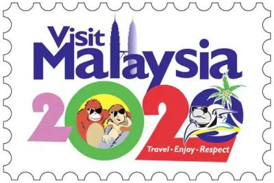
This widely mocked piece of “hideous” work is said to put the graphic design industry to shame. The newly announced Malaysia 2020 tourism logo considered so bad, several netizens flocked to offer alternatives.
One outlet went on to produce a rogues gallery of equally baffling location-promoting “design”. Of these, perhaps my favourite #epicfail was this piece of re-branding for a Northern English town, supposedly costing and eye-popping £110.000.
As one commentor noted, “well the sign sums Burnley council right up…keep going round in circles and end up in a right mess”.
![]()
I often try and make a kind of marque for a sales project.
It is something I would often recommend you do.
A visual cue unique to you can work wonders.
Yet as you can judge from the above pair, when even the so-called pros run into trouble, then for us the task is fraught with danger.
It can be relatively easy to make a silhouette of a specific piece of kit. Then say, apply a particular and relevant colour scheme to it.
Take a number that means something to your prospect and your slant on the deal. Then perhaps put it inside an outline of an existing logo.
Use a data graphic, recognised as depicting glory. Shorn of its legend and any ‘chartjunk’, it can be a signal you can utilise.
These are entry-level options.
Which should also be tested in advance of any serious broadcast too.
Happily introducing another way to see exactly who you friends are buyerside.