Seeing Your Sales Grid Of Despair (& Repair)
Here’s some wonderful illustrations I came across by way of downtime tabloid reading. The unfortunate author appears to have suffered a relationship breakdown. Hopefully their blog charts their return to form.
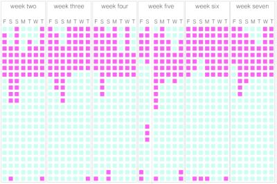
The above graphic (click to go through to the site) sought to assess the impact on sleep. Or lack thereof.
Laying bare all twenty-four hours from 0000 onwards, the pink signifies sleep, the blue awake. As determined by recorded web activity on their phone.
As you can see, not many nights provide adequate shut-eye.
The presentation though, is a delight, isn’t it?
With the ability to extract all sorts of meaningless drivel from corporate crm, you should be able to summon a listing of each dated activity (phone call, meeting, email – ‘touch’) for any particular prospect.
Then you could easily create your own day-by-day visualisation.
You’re not restricted to just two colours either. The days with no contact are simple. Then there’s different types of contact. I don’t mean how you connected, more how good was said connection? An entry level ‘good’ or ‘bad’ could do you for starters. Then you can expand as necessary.
Again, this kind of thing isn’t necessary for every deal. But one where you’re taking up a lot of organisational airtime – a bid gaining much focus from all around – and taking the time out to do something like this could prove priceless.
And as a final aside, such a grid (and make sure it is not like Microsoft project nonsense) will also look terrific in the eyes of prospects when you highlight what happens after they have signed their lives away to you…