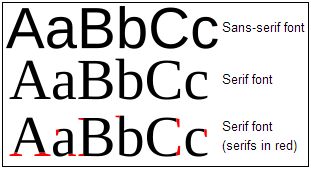
Serif Sans Serif
So there I was the other day, being forced to show interest (ahem) by a girl as she flicked through a dazzlingly glossy interior design magazine.
I was required to give a glimpse into my own design literacy. So I used the analogy that occurred to me way back when I had my first ever corporate logo created.
If design gravitates towards two poles, then as a layman I’d say they were Serif or Sans Serif.
Serif is the typographers’ word for fancy curls on typefaces. So when they are ‘sans’ (French for ‘without’) there are no such fancies.
I am very much a sans serif kind of boy.
Yet other people love serif.
And isn’t that the case with buyers?
Some love the detail. Others just the big picture.
Some love piccies and diagrams. Others reams of bullets and text.
Do you know which love which in your big prospect?
And what are you doing to make sure they get the info from you, in the style they crave?

