Should Your Slides Use Google's Chart-Topping Popsicle?
Due to a gooey google glitch well known to the world, a recent query returned unsought image results for ‘powerpoint slide’.
I was set to shake the head disapprovingly then recalibrate the search monster. But couldn’t help check what the monomind came back with.
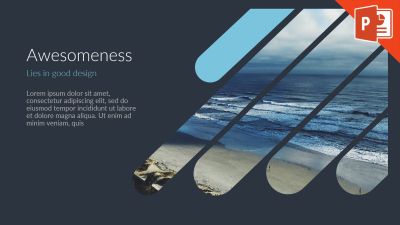
The image uptop was the Number One. What a lofty summit to scale, you’d think. The anointed top powerpoint dog. Quite the accolade. Powerpointer Andrzej Pach take a bow.
Although you wonder how this particular beach shot got chosen. Although at least it’s better than the image used in their how-to video.
It merits further thought. Particularly from our potential sales deck perspective.
The first point to consider, is that if this really is optimum design, then you’d expect plenty in similar vein to dominate the results. They did not.
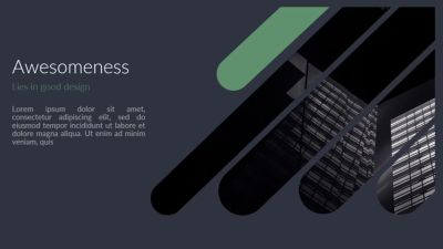
Admittedly, there was a notable absence of what you’d label ‘good’ design throughout the results. Many featuring the trad, outdated yet painfully still omnipresent, bullet points. Yet for the next one close to it, you had to scroll through, all the way down to Number 363. Yikes. Here it is.
Eerily alike. Then you spot the internet debate of plagiarism-vs-remix. If you take the dates of each slide’s youtube presence, then Mr Tumey above has allegedly copied Mr Pach’s from the top. His uploaded 24 May 2016. A full seven weeks after the possible ‘original’ appeared, dated 5 April 2016.
For good measure, second-to-the-ball also had the front/insight (*delete as you see fit) to provide a triple progression; name this (the “popsicle” slide), add a few variants of his own and also paste his post to that most cloudy of photocopiers, LinkedIn.
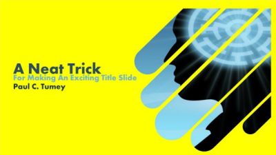
But it doesn’t stop there. Proving things come along in threes, here’s an upload from 12 July 2017. It only came to light when specifically looking to “view more” alongside the initial treatment. The first such “Modern PowerPoint Presentation Slide Design” tip from a “pdfediting”, who began youtubing 9 December 2016;

Imitation is the highest form of flattery. If it’s good, it gets copied. What works, spreads.
blah yadah whatevs
One main impression nags away though.
What kind of world do google say we’re living in for this to be Numero Uno?
This does not strike me as execution of ‘good’ design.
Those “popsicles” are amiss. Not a hit.
The concept though, can be a winner.
Take a recognisable shape. A logo, perhaps. Or silhouette. A relevant audience item or landmark building, say.
And “fill” with an impactful image.
Or as rather seems the case here, more specifically use for the fill the ‘slide background image’.
Then reality check.
Is what you’ve done really better than a full-screen picture with the odd word of text on it?
It likely depends on both the actual shape you’ve filled in along with calibre of photo within it.
Which if you get right, can indeed be a slide of “awesomeness“.