Show Cost Flattens Out, Don't Lose Big Returns
A niche sales point, here’s an occasional handle option for a specific new product price objection.
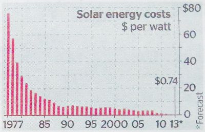
I saw this tiny thumbnail graph from the often wonderful Times of London’s graphic dept. My pic is from the actual newsprint edition, 3 June 2015.
It depicts the typical technology related cost fall of a new invention over time.
Energy from solar power plummets from around $80 a watt in 1977, to less than a dollar (74c) by 2013. A heck of a drop, even if it is over 36 years. And by the end of next year (2016) it’s projected to be under 40 cents.
But wait. what happened by 1989?
Is that around $3?
So in just a dozen early years, costs cliff-faced 80 to 3. A huge reduction. Then it seems to have pretty much levelled out. Despite all our advances in the last quarter-century.
This matches all sorts of well-known items. DVD players are probably the most referred to consumer good in this regard. With many more industrial wares in the same boat.
There’s two takeaways for the new product solution seller.
First, if you’re in that first decade of your solar cycle, then you’re going to need substantial, provable, utterly desirable returns. Found the early adopters? If super-returns – let’s go economist and term them ‘abnormal’ – aren’t yet concrete, then there must be other hooks to hang on. Most often the ‘getting-ahead’ angle.
Second, if you’re beyond those initial twelve years in solar development, then the excuse of ‘cost’ should never burn you. There likely won’t be anything to gain from a buyer putting off the purchase based on price deflation expectations. Especially when they’d be missing out on all those juicy returns through procrastination.
A commonly deployed close is to suggest your price has ‘stabilised’. “Look!” It has reached its natural lowest mark. Making now the perfect purchase point.
In the right intellectual setting, this graph could help smooth your path.
I’d have to pick my arena with care. Yet I can see myself popping this barchart up and pointing to key elements to get my point across to highlight ‘now’ as ideal.
Not only as a kind of Moore’s Law example (suggesting the cost of tech halves as its capability doubles, every 18 months or so). But also as a demonstration of results. Imagine flipping this chart. If returns are a mirror image, then they start small and go big. Almost exponentially. So you simply must buy sooner to enjoy the bulging bonus.