Tax Breakdown Donuts & Arcs
A few presentation ideas from the world of tax.
The UK election campaign is well underway.
Both main parties seem to dismiss any chance of tax rises.
The electorate can’t quite believe them.
A few months back, the current government conducted an exercise in transparency and better communication.
They sent a breakdown of where tax goes to every taxpayer.
Each tailored to the amount paid by them.
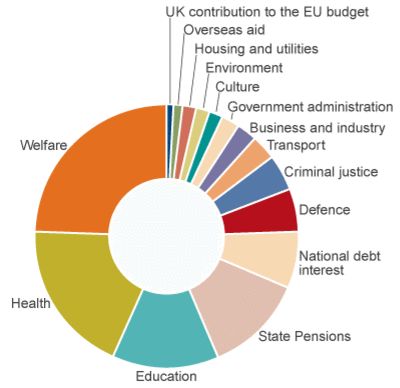
See the donut pie chart up top.
In the hole of the ring, your total tax paid is listed;

Alongside to the left, this personal total was broken down into each segment in a numerical list. With the feel of straight from a spreadsheet.
Unlike far too many a donut, the centre of this one has a purpose. It is used to ram home that this is a graph personal to the recipient.
A message for anyone choosing this style depiction.
The fifteen colours used are each distinct. Fairly neutral hues. Not a bold, primary tone in sight. None intended to catch the eye first.
Then there’s the web’s reaction to this.
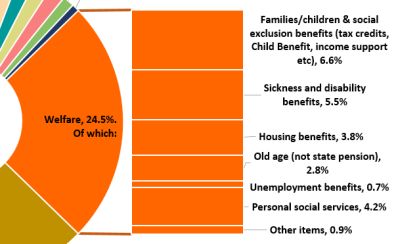
Two that tackle the largest slice caught my attention. First with a simple rotation and stacked bar (and slightly energised shades);
Next a fancy arc, akin to a slice of donut;
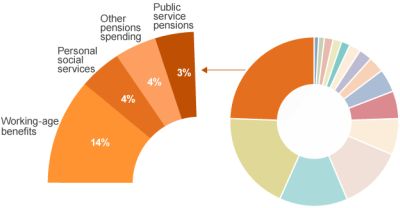
The tactic in general is a winner to memorably zoom in on one component.
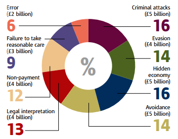
I also came across another treatment. From an interpretation of missing tax revenue causes. I like the neatly aligned large figure idea;
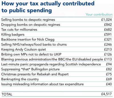
And finally, when it comes to web tips, there’s always the spoofs. This (left-wing) one via Huffington Post (in the list format mentioned above here) shows how you can get a point across in an irreverent way. But as with any application of comedy in the sales arena, remember the health warning that comes with it;