Using Bloomberg's Chart Attack Tactics
If you fancy a quick tutorial with best-practice for how to present using data, then Bloomberg have a daily feature you must look up.
This slot is great. Each day, in just a minute or two, they aim to “show you a chart that’ll make you smarter”.
Okay, so they tend to stick to line graphs. And they do use a bit too much American and finance jargon. But pretty much every time you get to see the point rather well.
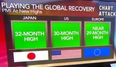
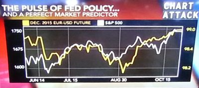
These screenshots I took of my telly some time back have them riffing on a ‘perfect market indicator‘ to find their US Fed “crystal ball”.

No need to get hung up on ‘what’ they present. It’s all in the ‘how’.
There’s several decent takeaways from within their video vault. It’s worth it to see how different experts bring out their key points from each chart. From the language they use to the type of data sets deployed.
A key one is, that they are loathed to view any graph in isolation. For any data set to have impact, it’s best to have another to compare it against.
You probably only need to watch a handful to get ideas. Simply click on one that ever intrigues you or you know a bit about.
… & by way of further brief example, here’s more of what they offer us up. If there are still salespeople using plain text bullets, well, this is how easy it can be to enliven your message and ensure it better sticks;