Warning: Your Sales League Table Could Be Demotivating
Well. Hardly news if you’re bottom of the log.
Yet recent reminders of salesroom scoreboards (from diverse as Wales and a Hollywood Wolf) shine my spotlight on what exactly is it that gets written on the whiteboard day in, day out. Let alone what gets projected onto the wall in the end of term sales meetings in front of all and sundry.
My very first salesfloor had merely a monthly new business accumulation. Wiped clean each new month dawn. My second only had quarterly brand new meeting tallies.
Other sales stats were circulated for sure. But these were the only ever-present visuals.
I was even in a multi-million dollar New York and San Francisco operation a few months back where neither sales office had any such thing on display. Nothing at all.
I do like my scoreboards.
My experience is that there is usually someone on the floor (in an admin or support capacity) that actually enjoys maintaining them too.
But what to have writ large?
The default position is around running totals. Yet there are so many more options. Why alienate those that cannot possibly reach the summit, yet can still improve greatly, through the bludgeon of this weighty club?
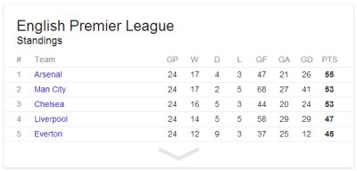
My mind thinks of sport tables. League tables abound. Take football. In this case, the helta-skelter of the world’s most watched, the English Premier League, after the weekend’s blistering EPL season kick-off on what is its 25th birthday.
Every paper and website will show tables. Games played, won, drawn, lost, goals for, goals against, goal difference, points.
Even a simple google displays this atop the results page (deliberately taken from Feb ’14);
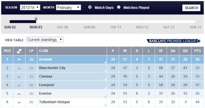
The official website doesn’t do much better at first click;
But then they also serve up this impressive form guide.
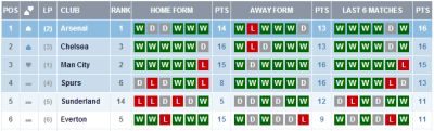
Only occasionally will we be presented with this across media. It usually looks at just the last six matches.
I also found a ‘streak’ table. A fansite showed live who’d won and lost most games on the bounce.
Alternate angles are so hard to find, yet do exist. Even from a tabloid no less. I love this form-against-top-half-sides rearrangement from half-way through the current campaign.

Yet they missed quiet a trick by not having a column for current (actual) league position. (The official site’s form guide does). When doing such a comparison you’d think that was essential.
Considering the reach of this particular competition, you’d think there’d be stats geeks the world over crunching myriad ways to see things differently.
It doesn’t take much imagination to conjure up avenues that might shed huge potential insight into results;
when playing teams above or below
beating (or not) expected results
when conceding first (‘going one down’)
after drawing/winning/losing at half time
following more than one/two changes in starting line-up
chances on target created
keeper having to work
improvement versus this time last year
performances after a midweek match
when they have least/most possession
Sure, some of them may be wildly misleading, irrelevant or plain daft. Yet among them will always be a real gem.
The point is that whilst never losing site of the big picture – the overall log – there’s plenty of scope to get creative and allow you to permit someone to shine that’s moving in the right direction.
Whether you’re a sales manager or a salesperson making your own way, there’ll be another way of looking at performance that can motivate your charges/you and get more (people) revved up than is the case with the bog standard listing.