Anti-Spam Professor Chart Choice
Peter Vamplew is a Professor with a cause. Exasperated by ever lowering standards of published articles at the hands of “predatory” automated journals – both boosting undeserving author credentials via payment and bombarding him with spam – he ran an experiment.
He submitted a totally ridiculous 10-pager deliberately masquerading as an academic paper to the “publication”.
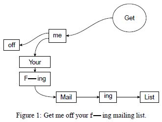
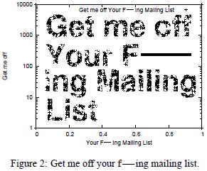
It featured but a single seven word phrase, repeated hundreds of times, within a framework of a handful of sectional titles, a pair of false references and made-up author duo details. Also accompanied by a Figure 1 and Figure 2.
Incredibly, his ‘work’ was accepted.
We’re all grown-ups here, so you can see that very phrase for yourself in my screengrabs, above and below.
(sidenote; a seven word mantra… Kathy McAfee would be pleased)
And it is these two graphics that intrigued me.
If you take it that to add a vital element of authenticity certain charting was required, then his choice of which types of drawing are interesting ones.
Figure 1 looks at first glance like a flow chart. Yet it isn’t. it is merely circles and squares of differing dimensions, each holding a single word and linked by an arrow of varying straightness or curl. One such link evenly randomly appears to go off nowhere to one side.
Figure 2 has the initial appearance of perhaps a scatterplot. One who’s values conveniently fall into the same pattern as the 7-worder writ large. Or do they? Note the single ‘+’ value plotted, for that chuckling detail.
I replicated these (see my coinciding upload to instagram) over a couple of leisurely hours, using a more personal pitch.
For a simple similar slogan, they’d make for a lovely slide. Particularly when inserted among a procession of several data depictions.
One that especially when from the prospect’s viewpoint, would certainly be most memorable.