Graphical Flourishes From Newsprint Altitude
For those with a little time and inclination to go beyond Powerpoint graph wizards.
Via a tragedy you don’t want to believe happened.
So Germanwings co-pilot Andreas Lubitz plunged 150 to death over the Alps, en route from Barcelona to Dusseldorf.
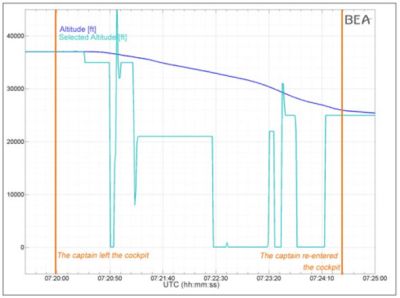
The French investigators (BEA) published the graph above in their interim report.
To the watching world’s horror, it shows Lubitz had practised his fatal descent.
Here’s their text, slightly clearer;
Whilst the graph holds a degree of aesthetic merit, these markers seem too small for me. And whereas there is a chilling starkness to the lines, I also wondered whether greater focus could have been bought to bear. Details such as the colours chosen and blank background for either timeline and height irked me.
Then I began to see other treatment of this same data.
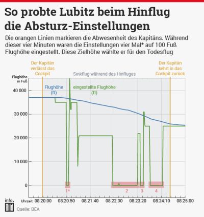
Many news organisations were fairly faithful to the original presentation. Here’s The Guardian. Even sticking close to the French colours.
Yet they show the impact of clearer labels all round, especially on the axes, as well as the cheeky grid joining them all together.
Simple tweaks. A definite improvement.
Then I saw the BBC take.
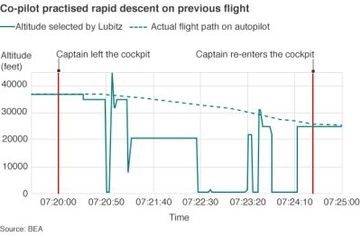
A dotted line.
Interesting. Shame they left the axes as per the original and the toned down hues don’t quite work for me either.
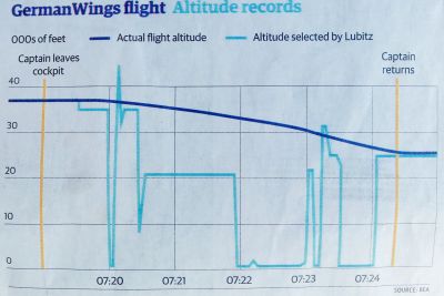
Then the Germans. Here’s a text-heavy slide version from Bild.
Any graph that has this much text alongside wouldn’t be my choice for a slide.
Whilst they stick a touch too rigidly to the original, those highlights for where the altimeter hits the ground do catch the eye.
Finally I took a pic of what the often excellent Times designers produced.
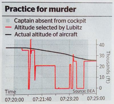
Their use of colour I do like. Contrasting red and black. And they’re the only ones to ditch the lines for Captain absence. In favour of a shaded area. Less Is More.
They stuck to the original timeline labelling. A bit of a shame. The source credit is possibly in the wrong spot. And I wonder if you could have incorporated the Bild ground’s zero setting somehow. Yet their title bar also works best I feel.
Still, plenty of little flourishes well worth bearing in mind for your next Sales presentation of the numbers that’ll help set you apart.