Highlight Like Google
Here’s something that sparked off loads of ideas for me the other day.
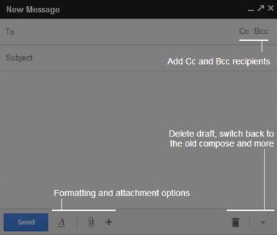
I clicked on ‘compose’ in my gmail, and got this pop-up:
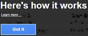
And to the left of it, this also appeared
It was all so simple. Three main points to help me with what changed most from the ‘old’ way, and a link to more if I so needed.
I instantly thought of the most common pitch when an iteration is newly released.
…you must buy it, ‘cos it’s better now
With no explanation of what “better” represents.
How tired. How useless.
I immediately thought of how Google’s approach could be adapted to almost anything. Considerably improving upon the usual misguided whimpers.
My mind conjured up a pic of a data centre (something I helped a global firm with over the Summer). And with the easiest of powerpointing, how I could draw horizontal arrows into the building, indicating better speeds, circling the door to indicate enhanced security, double-headed arrows going upwards to show more capacity, and adding those roadside work people icons to show more staff on hand.
With something like software, it’d be even easier, closer to the gmail example above.
I even realised a recent mini-project I aided (revolving around a dining franchise!) could simply show a burger with all sorts of marks scrawled as to how it is ‘new and improved’.
Whatever your product or service is, there’s a photo that can represent it.
And all you need to do, is draw a two or three arrows that point to what is ‘better’ about the new flavour, version 2.0 or ‘next year’s model’.
Both a great internal training device, as well as winning customer education tool.