Improve Your Visual With A Weather Tweak
Here’s something I noticed recently by happy accident.
UK TV channel itv has slightly tweaked their weather visuals.
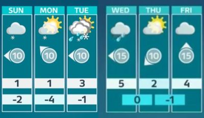
In my pic above, the old’s left and upgraded right.
I instantly loved it.
As once dark days move towards Spring, I’ve also noticed that the boxes containing the celsius go through a colourscale. From freezing blue, to chilly white, more temperate light green, then yellow and orange for strangely sun filled days.
The way they have newly positioned night-time is delicious.
It’s a good reminder that to both stand out and make more sense, data or images on slides need not necessarily have to be neatly aligned.
This is a concept that can be applied to almost any presentation. Especially one where you want a certain number to leap out the screen. And whoosh at your audience’s heads like a spear from a James Cameron 3D movie. So go ahead and gleefully give your graphics their own Spring clean makeover.