Living Equations Wall
It looks like the @UofGMaths_Stats building got a little carried away with all its equations! ✍️
— University of Glasgow (@UofGlasgow) July 17, 2024
Graphics have been added to the building, which were generated by members of staff in the School of Mathematics & Statistics. They were asked to submit handwritten diagrams and… pic.twitter.com/cCd9ysdiL0
This building is not my alma mater. And whilst this department is not what I read at uni, I did partake in a couple of maths based modules beyond accounting in my b-school career.
I instantly loved the idea of this cultural signage though.
Ask those inside for their driving research equations of the day. Then slap 'em magnified across the facade of their workplace.
There's also diagrams, graphs and charts to admire.
Each time I enter a salesroom for the first time, I tend to shed a tear inside.
There's the two extremes most prevalent. Either you feel as if you've wandered into a serviced-office where you're not allowed to stick anything on the precious walls. Or there's the highly expensive internal branding signifiers as if a self-appointed ambassador and silicon valley bro whose partner once dabbled in design ran amok in the style of Spinal Tap for the VC age.
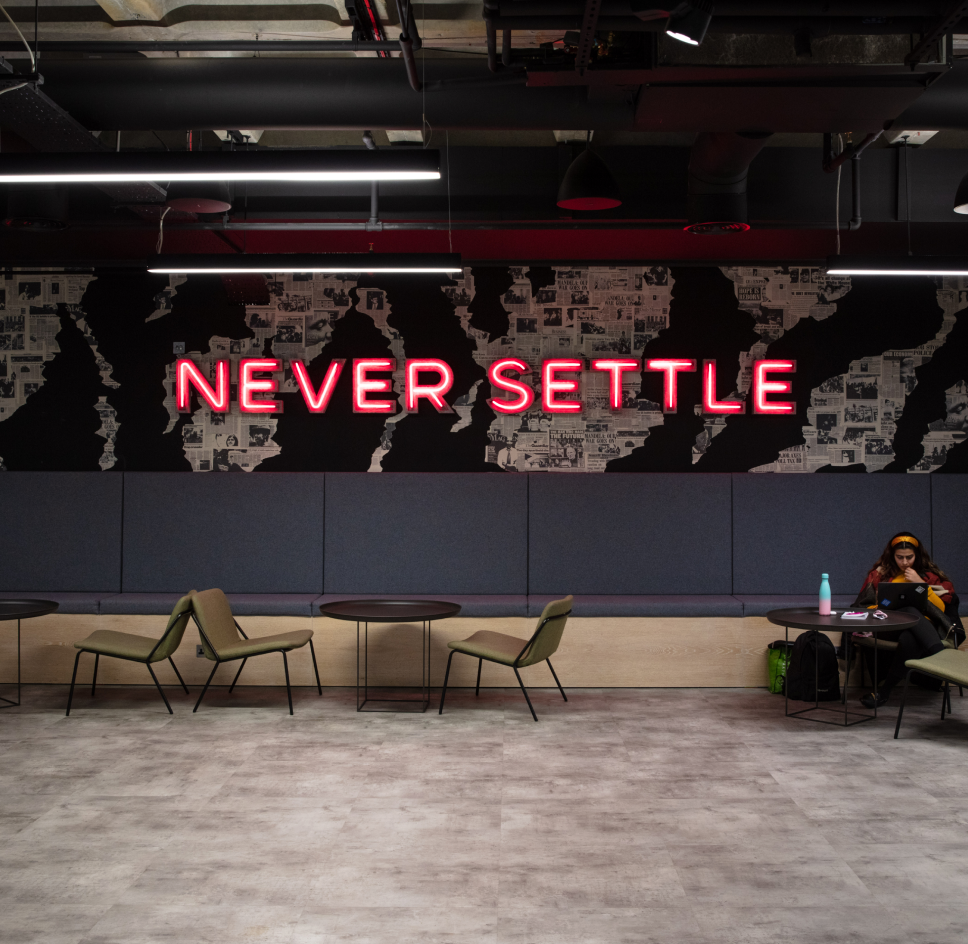
Around the same time, I noted a UK-based challenger bank founded by a couple of Russians granted some sort of licence. Photos of their swanky Canary Wharf office focused on one particular wall. In a kind of breakout area, emblazoned in large red LED capital letters, their primary of five underpinning mantras; Never Settle. Here's their sample on this day of my posting here;

The wall itself seems plastered with some non-descript aged newspaper print pages, haphazardly blotched with some brown paint lakes here and there. I googled for more imagery. The room seems, well, a bit gloomy. Despite the daylight coming from one side of glass-partitioned offices. I couldn't help but think of the wasted opportunity. Even down to having the wall coloured in the distinctive gradients of their bank card.
Whilst many might bemoan such sloganeering, the phrases that people can genuinely get behind hold cultural importance.
I also recall recently seeing - perhaps from nearby Shoreditch - portraits of another fintech disrupting founder. In front of his own wall of slogans. This particular link below is to The Times.

'Money without borders' driven Wise and their graffiti-esque filled wall of their aspirations.
From what I can make out, the uni makeover above comes seven years after moving in to the then new modular building. Suggesting time is no barrier to redesign.
And there's likely countless examples of similar lurking inside other workplaces.
The trick is to hit that sweet spot before corporate Orwellian brainwashing strikes, with its vacuous 'successorize' style platitudes, without feeling kids with crayons have been let loose.
I always go on about how your immediate space ought reinforce your process markers. Yet outside this essential, the reasons you exist as an enterprise can also be writ for all to see somewhere too.
Why not start small?
Surely not all sideways vertical real estate on offer in your surrounds is sacred.
Maybe start with a couple of sheets taken out the team printer, a couple of marker pens and a little sticky putty.
Even go a touch larger. You've probably got a flipchart pad which can contribute a sheet or three from its easel. Mock up what you write on a normal page first. Then make your preferred draft real.
Anything to fight against the usually banal, underwhelming and generally useless marketing or corporate comms 'zingers' posted around the place.
Make a sign. Make waves. Make your values sing.
