Vote Hexagonal Like Skynews Graphics
Most of presentation ideas I get these days go straight through my instagram, but occasionally I catch a vibe that merits deeper riffing.
This one comes via the graphicists at London’s rolling tv channel Sky News.
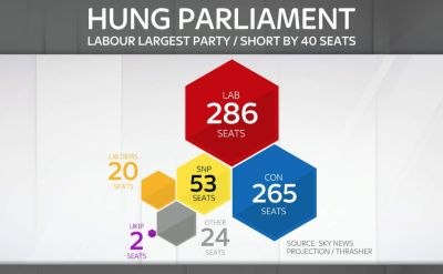
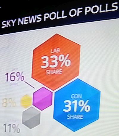
Always on the lookout for pie and bar chart alternatives, I warmly appreciated their infographic style treatment of election poll projections 100 days from the next UK vote. I’m especially keen on imagery easy to replicate for those of us without any art schooling at all.
Here’s a couple of shots of their in-studio slanted big screen.
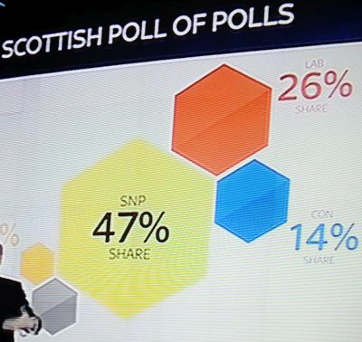
Scottish intent shows how you can move the hexagons around to help propel your conclusions.
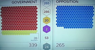
Even when resorting to the more traditional in-out scoreboard, they still deploy hexagons.
And to show how the theme can grow, here’s a three-way policy comparison.
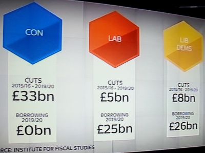
If you’re a salesperson that can devote a touch more time to producing any such graphic than hexagons require, then there’s great scope to build on this tactic.
I recall crafting a slide a while back which gained me tremendous recall and positive progress on a bid.
The prospect logo when shorn of its letters was a distinctive shape. One I could recreate fairly easily.
Geometry complete, I merely scaled it in this style. I guesstimated the areas to correspond to the relative values with the oblong dimensions of said grouped shape.
A great way to make a winning impression and further your ambitions.