When Short Of Slidedeck Colour Ideas
Following on from earlier colour suggestions where you’re client has only monochrome schemes. I found that many a colour company creates PR around ‘trends’.
First up, Pantone. They anoint their own ‘colour of the year’. And why wouldn’t they?!
(…the site which informed me appears useful for ppt tips once in a while too).
In similar vein to my recent musings on fashion palettes, if you are stuck for a colour scheme, then you could do worse than follow their choices.
They champion a worryingly menacing dark-pinky-lilac for 2014. Luckily, perhaps better selections than ‘radiant orchid’ lie in wait from their previous years’ gallery.
You can easily surf to get all the RGB values and the like (use their Pantone code) to create ourselves in Powerpoint. If you are so minded, you can even click through their own site to see why the colours were chosen and happily educate that grey-suited audience of yours.
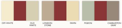
Then there’s uber-trendy smart-set swamping paint makers, Farrow & Ball.
They too issue what they regard as essential decorating trends.
Their choices are a often a more muted affair. Sometimes only marginally improving on the magnolia haze of my youth.
Still, they are different to Pantone in that their selections are meant to go together. So perhaps more fertile ground for a slide scheme whom you feel would appreciate decorative guidance as a bonus.
They offer several schemes around each colour they provide. Here’s three they suggest around what a one-time employer of mine insisted was every sales person’s favourite colour (!); red. A dark one here, which they call radicchio.
Whatever your audience may be into, secretly or otherwise, the odds are there’s a website out there with scheme solutions to help you stand out.