Can You Logo Up Your Charts?
Check out this graphic for a reminder on how to spruce up your presentations.
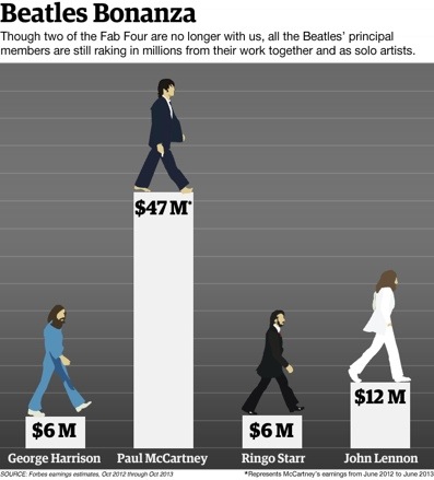
This is what Forbes terms the Beatles Bonanza. It’s the colossal earnings of the 1960s band members this past year.
It’s cool the way they’ve taken an iconic photo (from the famous Abbey Road zebra crossing album cover shot) as an avatar for each Beatle.
My photoshop skills would never stretch to taking those images and cartooning them up like they did here.
Yet I can still take the concept.
After all, how many times do we make a quick pie or bar, like the simple four bar histogram here, and just settle for typing a name as a label?
Granted, if the slices represent a time period, then finding an icon might be tricky.
But for every other use, they must abound. Product pics, client logos, competition indents, people.
I like the trend for showing a company by its initial letter only too. Like the ubiquitous ‘t’ and ‘f’ for twitter and facebook.
Most corporate designs today allow for this treatment.
For a little piece of extra effort, such imagery greatly improves the chance of your slide’s chart getting noticed and, more importantly, being remembered.
As a postscript, there is another funky way of showing this data.
I thought of this when I realised that Macca’s earnings were spot on two-thirds of the total.
A 2-to-1 split comes out neatly in a pie, but better still I think in a billionodollargram style square of blocks.
Simply make a box in a 10×7 grid and colour in the squares as you see fit, with the $47m taking up all of one side, and the remainder divided among the other three.
As for their excellent creation, I think it might look even cooler if the dollar amounts appeared instead below the bars, replacing the full names, and in their place simply put surely some of the most recognisable set of firstnames in the world; George Paul Ringo John.

