Can IPO Prospectus Graphics Give Your Slides A Lyft?
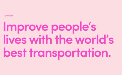
This is in effect the title slide from the flotation prospectus of ‘ride-hailing app’ Lyft. The ‘y’ by the way, apparently standing for “why”. I know…
As “mission statements” go, it’s sadly a shocker.
All hail … the personal jetpack!
Leaving the b-school Strategy module lesson to one side, does the way they displayed their ambitions provide any solution sell bests?
Besides the app screenshots and advert imagery, within the March 2019 275pp filing there are around twenty pieces of tailored imagery. Roughly half are charts, the rest, like the above, messaging.
Analysis of the content abounds (eg, inc, grizzle, fastco), but as for showing some of it, it appears many media organisations choose to go with the most visual. These also happened to be the first couple of pages.

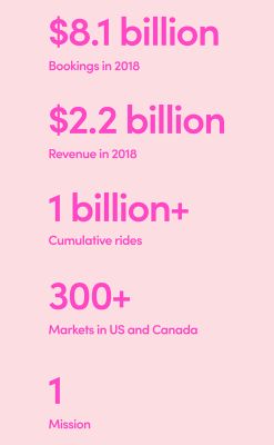
Like you ever have more than “1 Mission”.
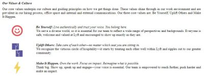
On pp148-9, there’s bizarre iconography. Relating to “values & culture”. Out of keeping with the general document tone. Probably best to avoid these types of subpar emoji. Here, in case you were wondering through the teenyness, highlighting the world-shattering delights of be yourself, uplift others & make it happen.
Among all the sparkly, mainly portrait pics in trendy settings, of happy drivers and passengers, there’s also a number of charts.
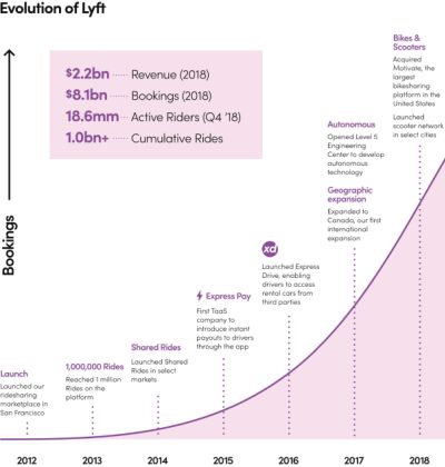
They tend to show a remarkable blandness. This upcurve above with annual landmarking pretty much the loan attempt to mix things up a little.
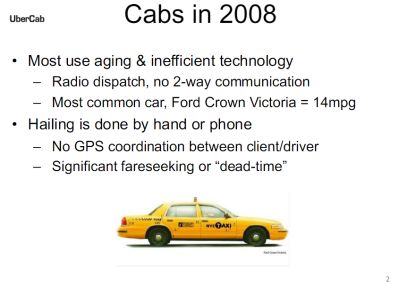
As I recently blogged on their latest ad campaign, it’s perhaps also worth noting how poor the first ever Uber deck was. Thankfully shared at its ninth anniversary. Like something from the last century, that 2008 self-labelled Next-Generation Car Service has come a long way from those days. It seems that the “founders … compared it to a private jet service”. Here’s slide 2 (of 25), following the title slide;