Trillion Dollar Graphics

The world’s largest sovereign wealth fund belongs to … Norway.
Currently valued at a cool one trillion dollars.
The envy of the planet.
In what other country would their ring-fenced (in this case oil) tax revenues starting forty years ago still remain not only intact, but grown exponentially and crucially, unplundered?
2018 wasn’t their greatest though. A 6.1% loss. Still…
They held a press conference to publish results. Handily also available as both a presentation pack and full blown annual report.
Having seen photos from the event, i was intrigued to see the slides used up close.
What do trillion-dollar slides look like? And can we take anything from them for our own sales deck creation?
First up, they have a colour code scheme. But poorly executed.
The blocks of colour above show this. The top line are the colours with which they code each one of the separate six chapters. Yet the lower line sees them slightly alter these as used to colour their charts. Strange. Also, in the main these are pastel type shades which are not taken from a single tone. Bland and with seemingly little connection. Hardly the trillioning impact.
Their first reveal of current losses shows this is the fifth drop in the past twenty years. Note the helpful trend line. The average is 5.5%. So all is good.
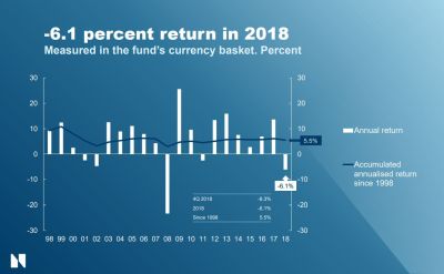
Yet compare this to the famous stat that ‘over the 100 years between 1917 and 2017, the average annual return for the UK’s FTSE All-Share is 7%, the American S&P500, 9%’. All that Nordic effort wasted?. Well, not exactly. As property takes an increasingly large share of their cake.
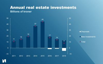
Despite my reservations about their lacklustre colours, there’s something in the main bar shade being the same as their corporate background. Blue on blue isn’t necessary the most dynamic, but when coupled with the white parts it can work. Also note the purple diamond and use of data labels.
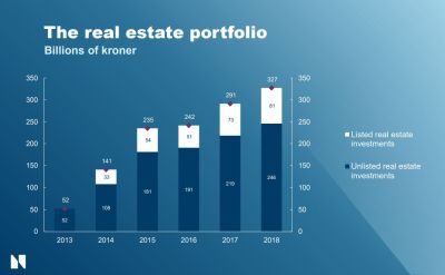
These charts also appear in the official document, but with white page backgrounds where the whites are switched for a less effective lighter blue.
Always happy to see the sadly under-used waterfall treatment, by the way.
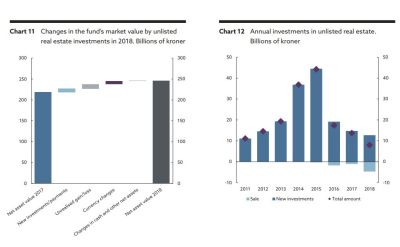
But wait. Oh dear.
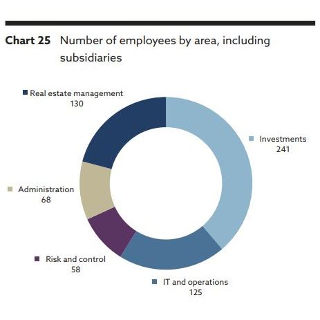
Yes, it’s the donut. I can hear Stephen Few wailing.
Although I sense he’d be pleased to see a table of numbers presented. Here again atop the standard backdrop.
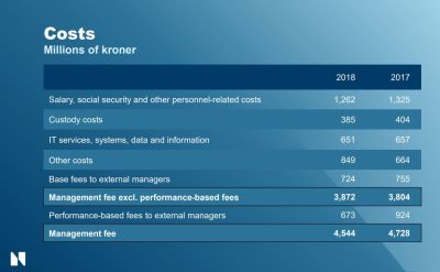
Note the way they use borders for highlighting rows.
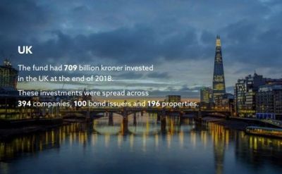
Now let’s finish by looking at pictures.
Never use stock photography is a pretty reliable rule. Yet they break it. They use nightscape snaps unlikely to garner instagram likes for New York, Paris and, shown here, London.
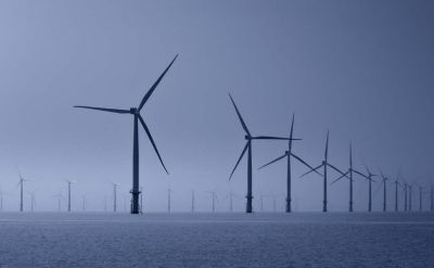
Then commit even bigger crimes. How about these offshore wind turbines.
But perhaps the worst offender is the very first pic you properly see. The inside front cover. Would you agree?