5 Lessons For Your Next Proposal Layout From UK Party Snap General Election 2017 Manifesto Designs
(roughly 8-minute read)
Almost solely a UK construct, the “manifesto” has evolved over the past century from single sheet wishlist to a considered, official document. Able to both hold the resultant administration to account and ensure legislative passage through the shame that is the unelected upper house.
With the last UK General Election I looked at 2015 manifestos to glean sales doc pointers. This year’s snap call let’s us do the same for 2017.
One key selling area is shut to us though. Maybe given the surprise nature of the poll, there’s virtually zero presentation of money or figures. Just two (minor) parties make the barest of effort to display tabular finances, one of which is consigned completely to a separate doc. The only one shown upfront purports to be a ‘5yr fiscal plan’. It features six sources of billions worth of budgetary savings which collapsed under even the gentle scrutiny of a cub reporter.
There are no graphs anywhere at all. Particularly galling. The now fairly traditional ‘menu without prices’ abound, such is the lack of any quantified funding sources within the documents themselves abandoned instead for media soundbiting.
Data graphics and number tables are vital components of any Prop we deliver. Here’s five ideas that are on display with this year’s party promises;
Your Document Title Is Important
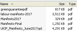
As before, as now. Shown by my old-school list above, official document file naming leaves plenty of room for improvement.
When your Prop fizzes around a prospect, potential buyers will see what you call it.
You may well be advised to reference how they term the bid. Yet you can also tag on a key usp you offer.
In the political case here, most voters would be hard pressed to recall any slogans. An obvious mine of titular inspiration. Apart from perhaps the early runner from the incumbent government (strong & stable) which faded as the seven week campaign lengthened (replaced by ‘best deal for brexit’ among others).
Despite their total lack of ‘cut-though’ each main party had a slogan which they slapped on the front of their manifestos. Time to play ‘match the mantra to the party’;
Britain Together
Change Britain’s Future
For The Many Not The Few
A Confident and Caring Britain
Forward Together (Our Plan for a Stronger Britain and a Prosperous Future)
Four Britain’s, two Futures, two Togethers, one Change. Where I wonder was Change Britain’s Future Together?
Key Wordsearch Check
Surely the nation’s (and my) favourite political nerd, Chris Mason, revelled in uncovering that the ruling party manifesto’s 84 pages mentioned Brexit 15 times. True indeed, yet 5 of them are on the very first page. A kind of exec summary ‘letter’ from the PM.
Given that they wanted this to be a simple, reductionist type election on this singular point alone, are ten mentions of it across 83 pages enough to ram their stance home?
None of the manifestos have an index page at the back. Nor normally would our Prop. But should they?
Many a Props final (pre-appendices) page (though not mine) tends to be what the prospect looks on as costs. Which we try and slant as Investment.
Combining such thoughts makes me think that a recap page – even in the style of best-practice presentation summary – could be a differentiating way to get across once more what your big, major pluses are.
And if there’s a proper noun you wish to have happily associated with your bid, then a simple wordsearch will both let you see if it features enough and draw further attention to it post-meat.
Use Of Images Ought Not Be Stock Shots
Well. Photos can be such a problem that the Conservatives decided to ignore them completely.
Even when I first stepped inside a sales office, nearly a decade before Microsoft Windows, salespeople still liked to slip a key photograph into their Props.
Often less is more. Just one, killer pic can elevate all that surrounds and secure a (the) selling point.
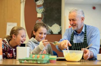
In the main, the imagery used by the rest, across the board is the kind of stock photography that contrives to make 20th century clipart look good. One notable exception whether staged or not, being this Labour pic tucked away (page 87 of 126). Their aproned leader stirring mixing bowl alongside smiling sous chef kids;
Even if an online library choice looks ‘nice’, do not use. Possibly the most striking example being the Libdem “close up of floating wind farm turbine”, via istock by Tomasz Wyszolmirski. A cool image indeed yet used here lazy, irrelevant and meaningless;

The Greens devoted full pages to the kind of unimaginative, bland, expressionless pictures you hated getting asked to write essays from in my English exam school days. Like with this from-the-lectern-view denoting (the slightly pleonasmic) “a citizens’ democracy”. Each also mystifyingly given a different colour sheen;

Deployments of photos were universally haphazard. There was the one party that did appear to use Powerpoint to make their graphics. Their anti-Starbucks tax avoidance (p12) quote a clear example. This Ukip work from their lgbt wing proudly grabbed your attention;
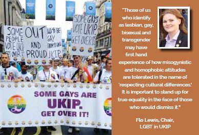
Worth also mentioning is their use of regular summary boxes called “we stand by our 2015 manifesto pledges to…”.
Structure
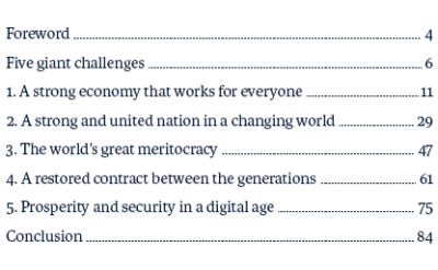
I can get quite annoyed here. Chiefly because many Contents pages breach my one-page rule, you find more chapters than weeks in the year, with abstract headings, little alignment with core reader viewpoints and they cause constant interruptions to an enlightening flow.
None of the contenders scored well.
At least this one example above sought brevity. Note, Foreward Conclusion. Five Giant Challenges isn’t great but is along better lines.
Colour Coding
Three chose as their dominant colour a different shade to that of their traditional rosette. And website. Corporate marketers would have kittens at this. But each worked I think.
The Conservative cover was darker. Colorhexa call it ‘very dark blue‘. Not the ‘pure blue’ of old. Then both the Libdems and Labour used what (again, colorhexa) adjectivise with ‘vivid’. Although the ‘vivid red’ looks to my eye a touch pinkish and the ‘vivid orange’ a tad dull.
Still, the sectional titles using this orange makes an impact, visually;

Didn’t most of the country seem to feel this got done last year. Remember brexit?
Still, a reminder that a dark background can lift its message text.
So it can be worth quietly having a little play with your given logo colour and go tonal.