60sec Wuhan Virus Slide Explainer
As new cases in the China origin tail off to a daily handful – although will a second spike be an inevitable wave – elsewhere replication of that regime’s aggressive social lockdowns aim to contain the novel coronavirus. The world shudders. What if this tactic is doomed? Will it fail in squashing terrifying ‘sombrero’ epidemic graphs?
Information pours. With Covid19 sweeping the globe lets us take the temperature of slide graphics.
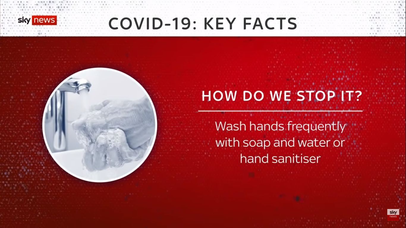
Such as an example played extensively as ad break bumpers from London’s Sky News. Their ‘Covid-19 Key Facts’ sixty-second explainer from early March.
Looking for a template, then Sky News posted – yet is strangely un-linked as of today – a nine-and-a-half slideshow that may give you an answer.
Pics in circles alongside headline plus subhead text. Note too that each background could have been the title slide with the blue circle, but they chose against that for a mainly red one, without the blue central circle.


It’s early days in this pandemic, so perhaps understandable that stats relating to infection rates and outcomes are left out. For now.
footnote
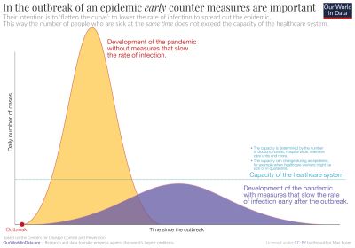
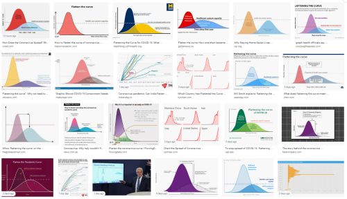
Graphs are set to feature prominently as the bug relentlessly marches on. These three expressions, all meaning the same thing, are now familiar to the world; flatten the curve, pull down the peak, squash the sombrero.
When you cannot stop the inevitable, you can though push it back and be able to handle the fallout much better. Lessening impact over longer time. Here’s hoping an “exit strategy” emerges…