A Different Logo Wall Treatment
Pretty much every corporate presentation has a logo wall. You know the kind of thing. Glossy idents of your valued clients plastered all over a blank background projected as big as can be.
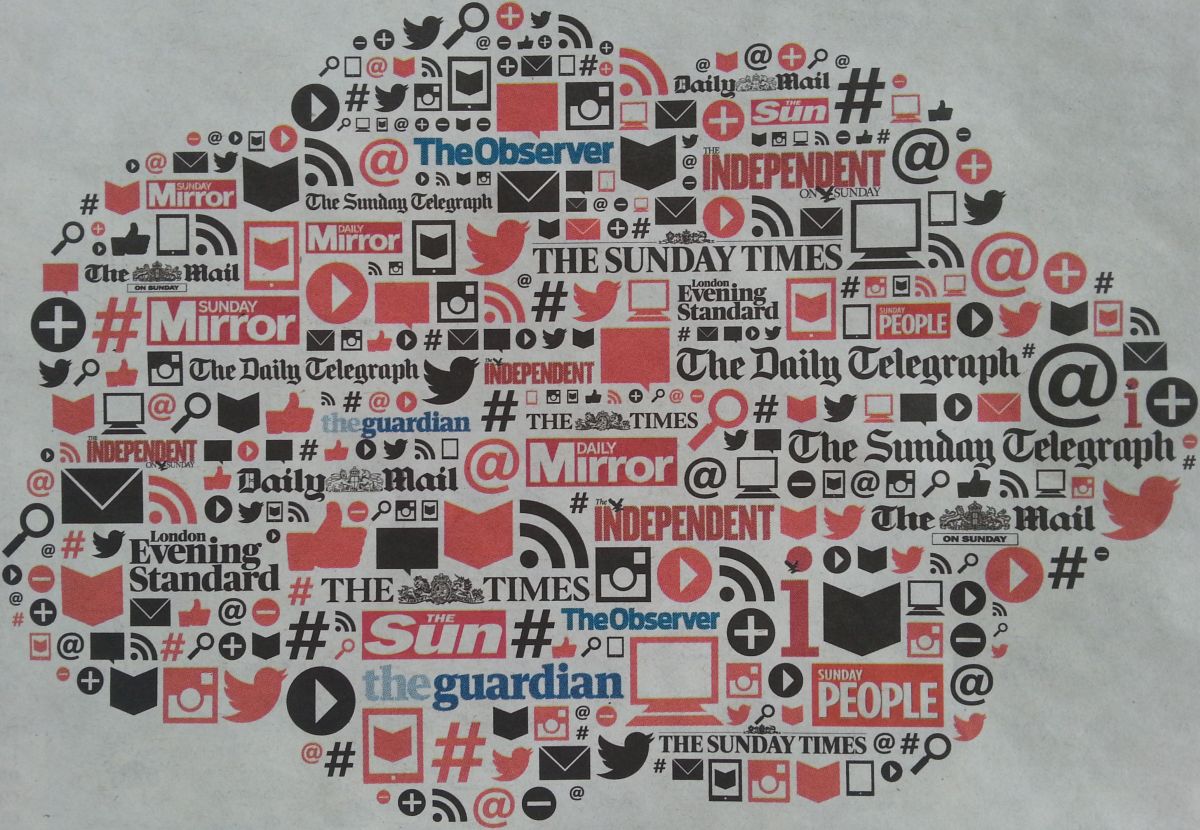
Well, here’s an ad I found reading away in a reception the other day. Its aim was to prove how wonderful advertising in all the UK’s national newspapers still can be, from an umbrella body. So they sought to show off all the labels in the stable;
I love this treatment. The logos are all tucked away. And that’s a winning point. In this case, among imagery that signifies ‘online’.
Why were they not simply placed in a grid?
Why do we always have ours in a grid?
I realise that adding all the ‘at’-signs, rss curves, hashtags, play buttons, search magnifying glasses, tweet-birds, envelopes, ‘like’ thumbs up, add and delete plus/minus, take-pic camera, screens, general arrows and the like looks like a lot of effort. But we wouldn’t have to go that far, surely, as you probably only need the odd icon. Way fewer than here.
And if we did, done once all the work is practically over and easy to edit.
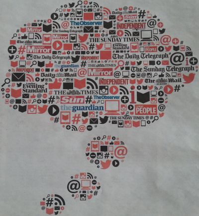
We wouldn’t need to do a clever cloud shape either. A standard landscape page filled would suffice.
And anyway, you could always pass the concept on to some keen soul in Marketing to test out, hey…
It’s an idea that would visually set apart any presentation when the inevitable flashing of reference names comes around.
& here’s my pic you can click on to see in larger glory: