Alternative Slide Ideas From A Green Presentation
I helped a marketing expert fine tune a presentation recently. The pitch sought to build on sustainability issues. Leaving aside the structural and strategic advice (for instance they’d developed 82 slides in total planning to show no more than 20 in any one sitting which I suggested may still be too many), I also workshopped how to show figures with more memorability and greater punch.
We are taught how to show data series from an early age. Everyone knows the virtues of histograms and pie charts. Yet what is shamefully neglected is how to present figures with true impact. It’s a constant drain that the ways in which you best promote the key message unfortunately eludes most people.
I’ve abridged all the originals for ease of my time, so by way of example, here are lesser imitations of three original slides.
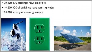

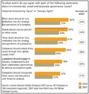
The latter pair are I believe courtesy of the UN. I worked through how to improve these by bringing out the one central point that each was constructed for. I then removed all unwanted white noise and created a script that whilst maintaining the knowledge of the original, began to really bring out the main takeaway required. This work was scribbled on paper at the time, but I’ve had a very quick play on everyone’s favourite Powerpoint for rough ‘n ready examples so that ideas can be triggered by these approaches.
For further analysis I’ll demonstrate both the core message the presenter desired and explain my graphical direction. In the interests of being concise, I’ll spare you the full script and show the foundation for the next generation of these three slides.
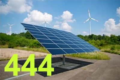
The solar panel shows the virtues of having only a single pic, removing confusion of three. The figure represents the South African fact that only 1 of 445 buildings apparently have green energy, therefore for each one that does there’s opportunity in the further 444 buildings that don’t.

The biggest balloon top-right represents the fact that of all CEO’s, an amazing 72%, that’s practically three-quarters, feel the number one reason to embrace greenery is for “brand, trust & reputation”. That dwarfs the other reasons such as legislation and cost reduction, right down to investor/shareholder pressure bottom-left, at just 12%.
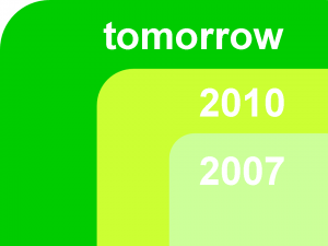
The expanding blocks show that on average over the past three years, CEO’s sustainable understanding has grown by around 25% for every single green driver. And at this rate is set to soar ever more.
Given more time, I already know I’d change these still further, but even without seeing them beyond sketch form, in context, fully-themed or animated, at least this should be enough to give anyone wanting to add sparkle to a presentation further ideas for extracting a core message.
