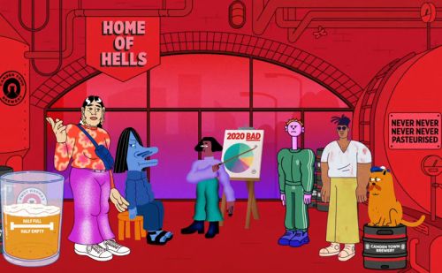
Brewery Piechart Hell
I do like a bit of pop culture pie.
Is this one though, a fail?
A London brewery, long since gobbled up by/sold out to Big Beer, showcases their latest ad. One “you can drink“.
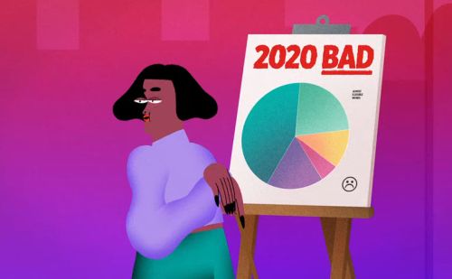
There are a couple of neat touches. The kind beloved by animators. Such as the writing alongside the pie being ALMOST ILLEGIBLE WORDS.
You can’t help but take in the message of the pie; 2020 BAD. Although did we need the frown emoji?
And slice colours nicely approximate to their range brand palette for half-dozen of their eight beers.
Yet there’s no clear connection between the six slices and why they so bad.
The most typical chart device would be a line graph. At some stage sloping down from left to right. Even falling off a ‘cliff’ at some point. But you can see why no brand wishes to be associated with any such declining imagery.
Similar issues might plague any barchart alternative.
So perhaps they played it safe.
Which is a shame.
Does their unimaginative, bland and standard choice of chart serve up a match for their product offering…?
Does yours?