Can You Better Stats Quack At The Flipchart
Alternative facts, fake news, post-truth, echo chambers, metropolitan liberal elite bias, satirical propaganda, partial impartiality.
Where to turn if you’re crying out for “true facts”?
The plethora of reality check vendors?
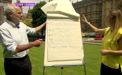
Here’s one. Oh dear. The man above on the left of the flipchart – a Professor for the Public Understanding of Risk no less – proves it pretty much impossible to be purely objective about any stat. Political or otherwise.
Here’s a close-up of this data presentation;
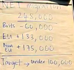
Data-prez guru Stephen Few would certainly applaud the beauty in raw numerics. But I didn’t feel it helped with his “explanation” at all.
All those noughts, plus and minus signs not aligned, the current total semi-meaningless perched on top, the ‘target’ almost but not quite set apart like accounting cash and the same blue pen used throughout.
When I first watched the clip, I wondered why the figures weren’t displayed like on a two-column spreadsheet. Closely followed by my exasperation at the single colour coupled with an absence of any underline or circling. Then I pondered whether a picto-approach could have worked. Waterfall perhaps? Praps not.
My point remains way more vivid than the impact of this sheet. If that was left on display in a meeting room for the next occupants, what would you want them to take form it? In this case, there’s too little.
Then the next imaging seemed in even more need of a ‘service’.

First up, I despaired that he used the Gini coefficient as his arbiter of Inequality. I’ve seen numerous people set out why it is a poor guide. Even wikipedia suggests an obvious flaw being it “measures relative, not absolute, wealth”.
Then it appears he revels in pointing out an apparent sharp increase in the 80s which he incorrectly labelled with a political dig. For instance, the rise compared to the final 70s administration starts only in the middle of the decade. Which seems to fly in the face of his (excellent) explanation of misleading graph origins following a UK growth improvement this February.
To my mind there’s no reason why he couldn’t have started the x-axis in 1990 and so giving a straightforward flatline. Or if he was hellbent on showing an elder context for potential future deviation, then from 1985 for surely better comparison.
Look at the section of the plot which shows differences. Those right-edge option lines are too small. Too squashed.
At least he’s now found a different colour pen. Hail the green.
Sadly this explanation reminds me of those wasted stats hours I attended where the lecturer happily drew a level vertical line rightwards from the end-point of a data set and claimed that this was as good as any fancy forecasting model.
His contemporary twitter feed saw him state, “I’m one of those who say never use a pie chart”. There’s many of them about. Often with good reason. Maybe he’ll go on to tweet, “less narrative, more point rammed home right between the eyes”.