Chart Graphics of 2025
Twelve months back, a selection of 16 graphics came through from 2024 as noteworthy for furthering our persuasive aims through charting.
Time to look at what 2025 doth brung.
Let's start off at basecamp. An entry-level, typical linegraph. If we presented such - which can be acceptable - the colours ought be different. I always fancy the darker background, thicker lines, and text-free legends. Especially if over video. The point here, is to really bring out the yawning chasm, getting ever wider.
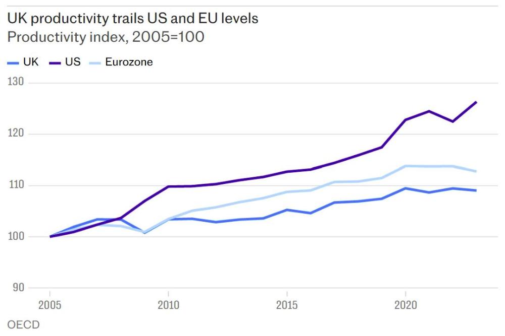
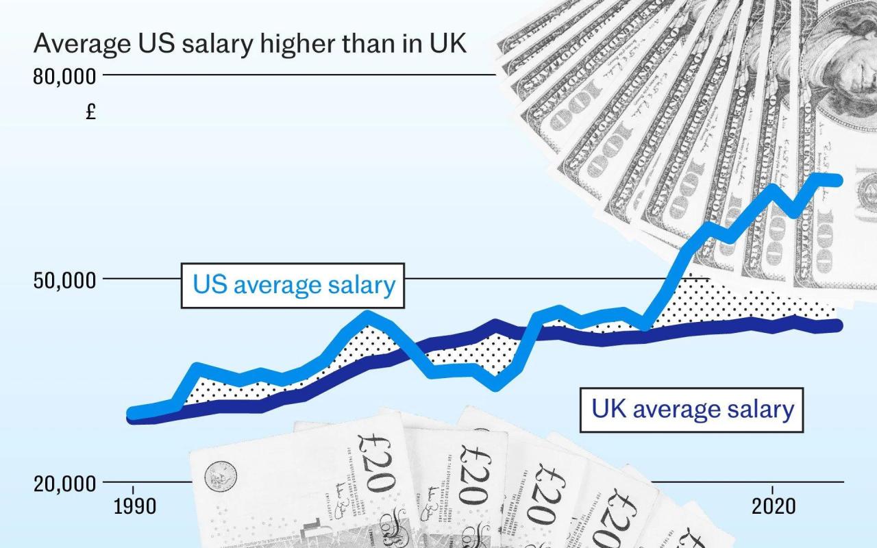
Here's how the same graphics team add a splash of chart-junk, whilst thickening those dastardly tell-tale lines.
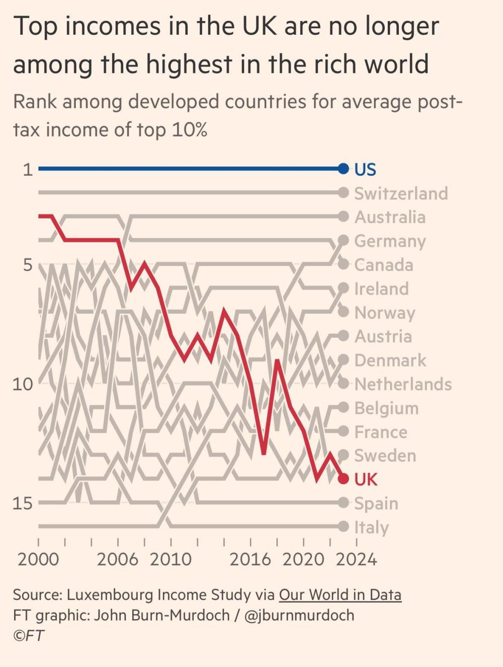
Continuing the theme of a tanking UK, here's a reminder of the under-used bump chart.
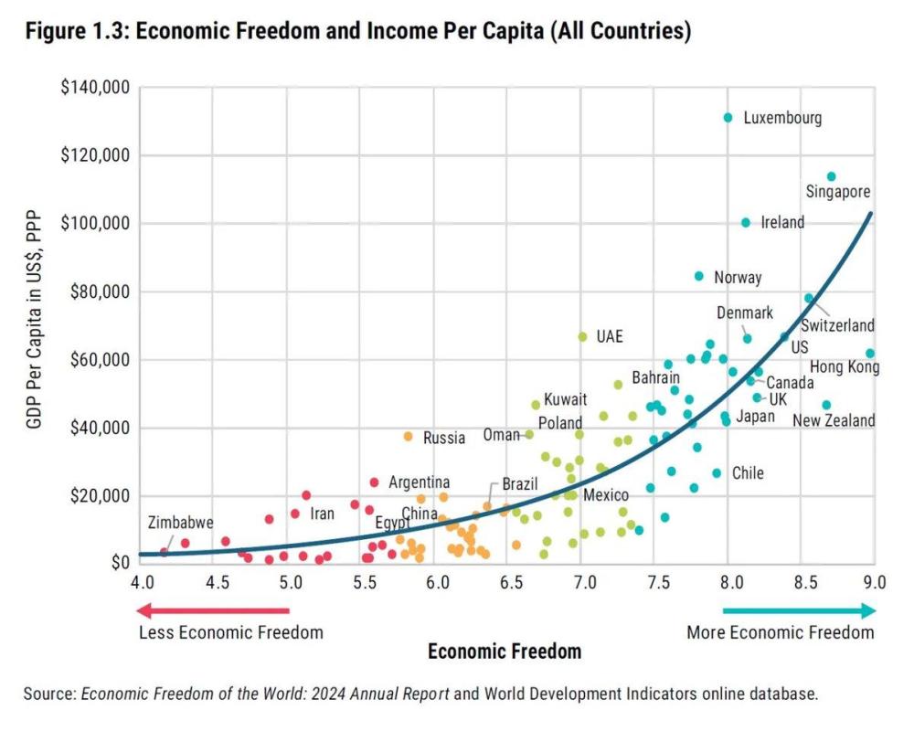
With a global outlook, here's one of the neatest trendlines you'll see. Also a message to those who through some inexplicable misplaced drive, see capitalism as the enemy.
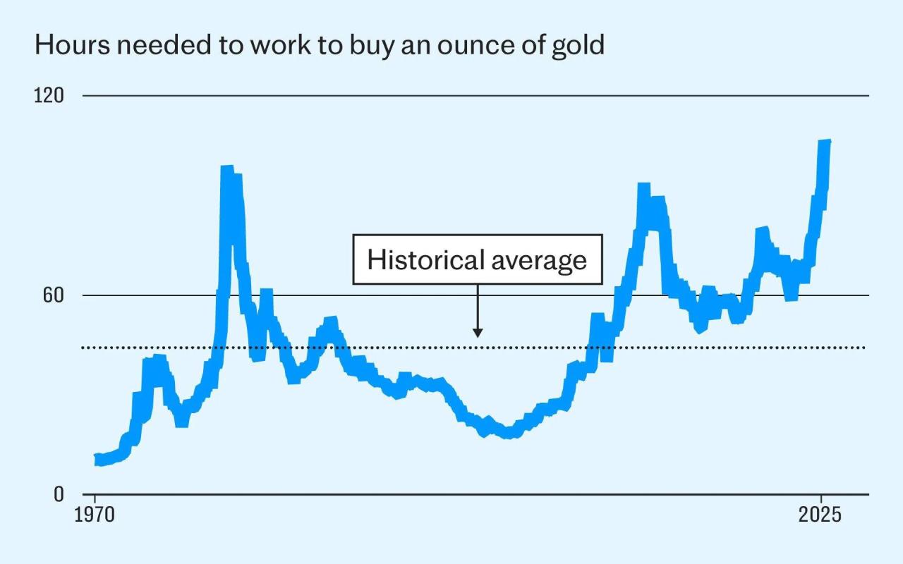
With another global indicator trying to tie us in knots for not buying gold around the turn of the Millennium.
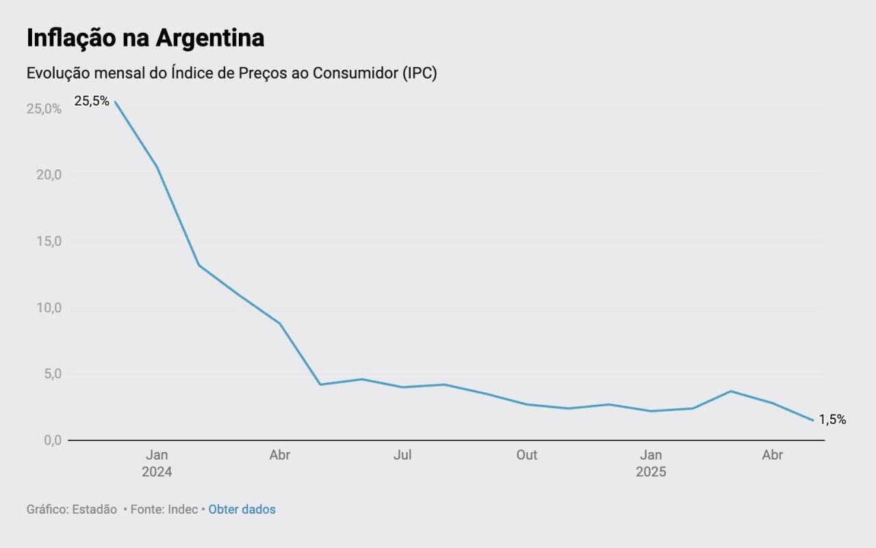
Sometimes a single indicator is all you need. Although we can make it truly stand out and imprint itself on our audience memory rather than give it the bog-standard if well-meaning treatment.
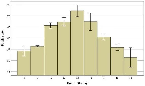
Away from finances, here's a final trad chart. Bars (with variance) showing best times to take an exam for achieving highest marks. Perhaps transferable to when to hold our meetings?
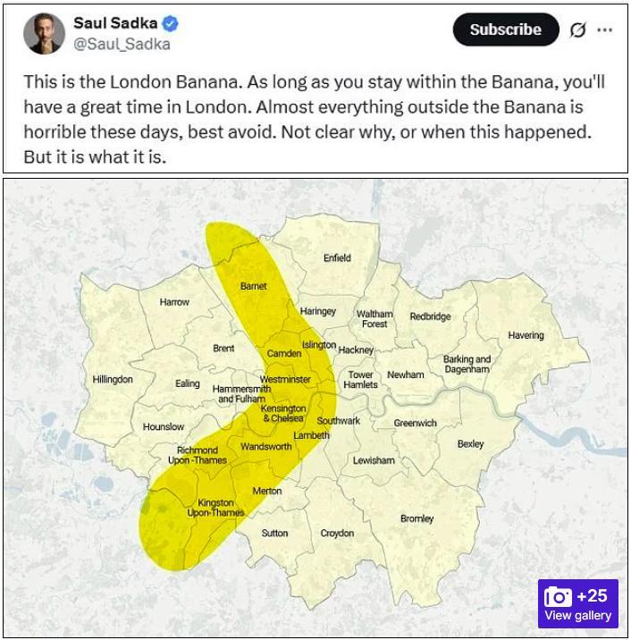
A trio of maps now. First a headline-grabbing demonstration of where London's going so wrong right now. Even branding it after a favourite fruit. Although I think we sadly know the 'why' & 'when'.
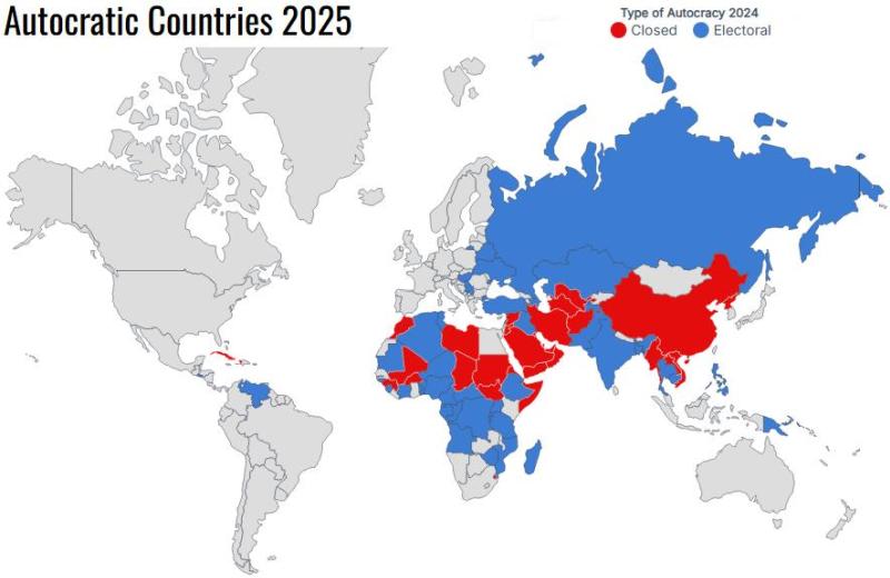
The rule of thumb is that even today we all live within a 50/50 split. How Freedom can continue to be denied is heartbreaking. Not the definitive list of offenders here for sure. A few not included, others wrongly labelled, but still. If you wish to focus on a particular segment this kind of approach can work.
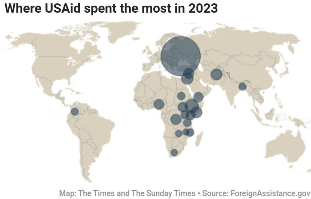
A cartogram with bubbles. These are often frowned upon, As they can distort the real differences. Also masking in this case, deeper corruption from back in '23.
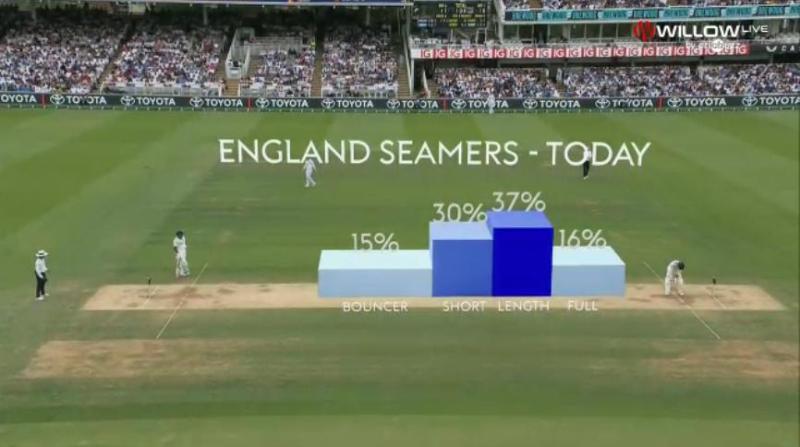
For fellow cricket lovers, here's a useful chart-on-photo vibe.
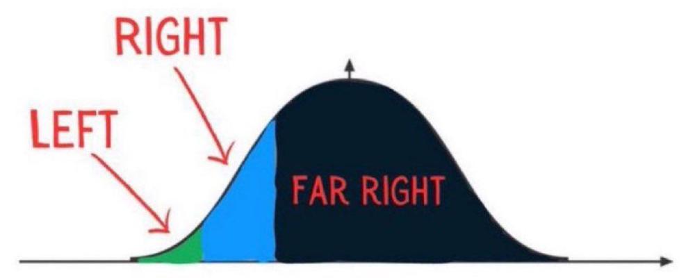
When did you last use a distribution curve to get your point across?
Likewise, filled in a 'calendar'?
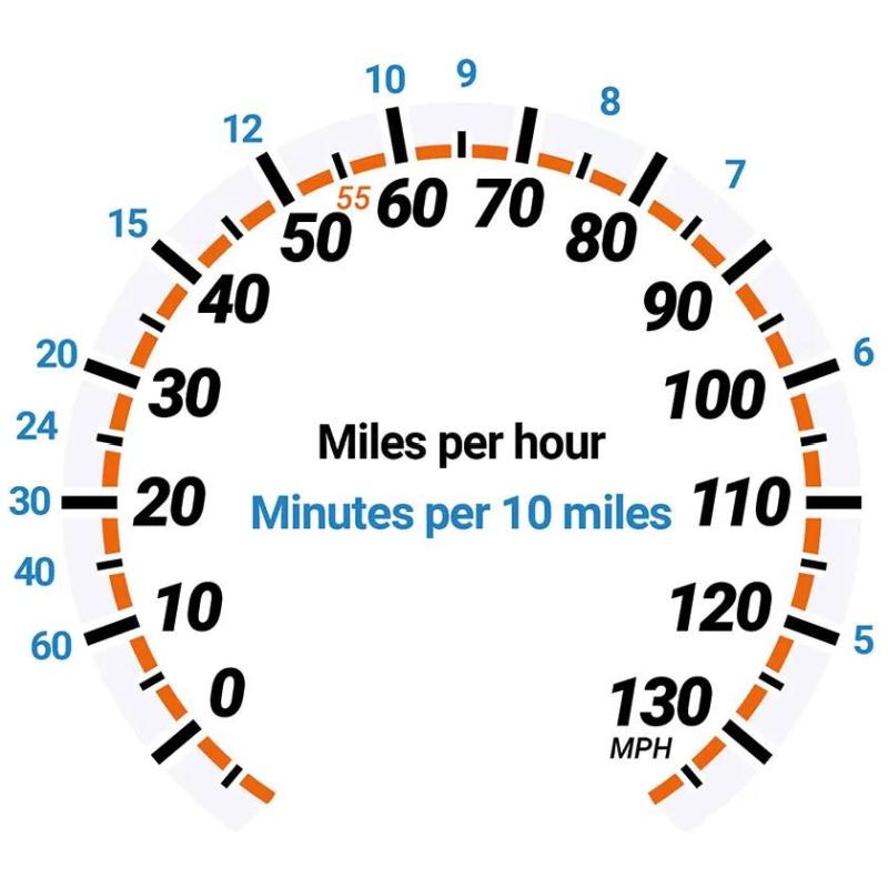
Let's move on to more unusual methods. Starting with this suitably jolting 'paceometer'.
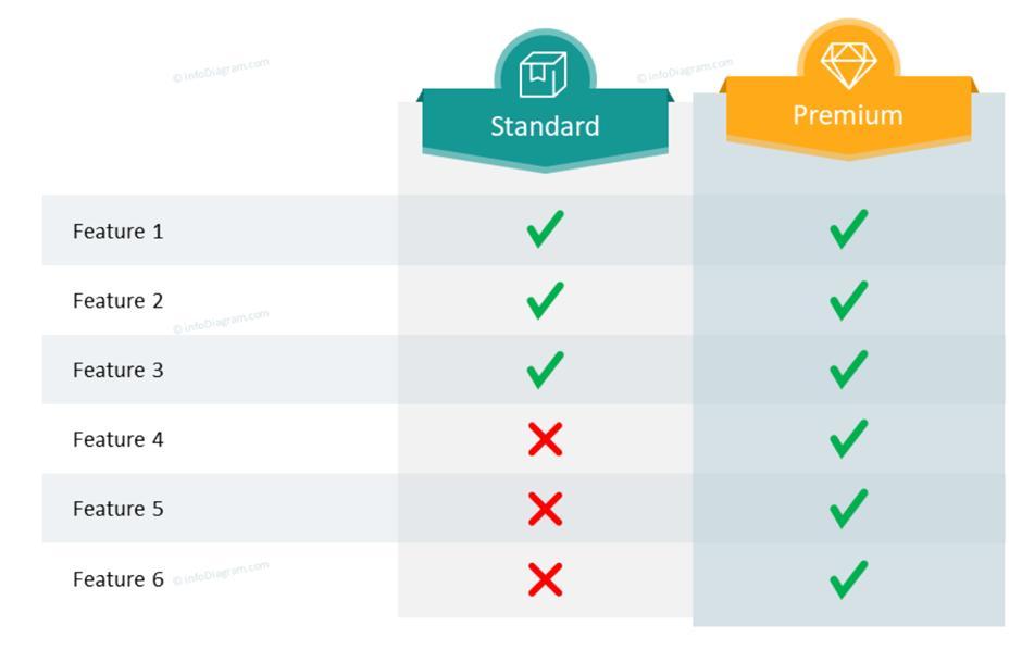
To channel the wisdom of Stephen Few and Edward Tufte, here's a table. Note where aesthetics are no barrier to ordering so long as the upper and lower extremes are grouped together.
Revisiting the world cloud. Beware these DEI dept replacement labels ...

Next, this tip on how to show your wares urging us to be much better than this norm.
Getting more 'creative', this sentiment may be awry, but these domino treatments were widely used across the year.
Today's Clovis Toon, Sunday, May 25, 2025.
— Jamaica Observer (@JamaicaObserver) May 25, 2025
See more cartoons: https://t.co/xCz52lprvo#Clovis #ClovisToon #JamaicaObserver #AlwaysAhead #OTeam pic.twitter.com/s3SmJijtL4
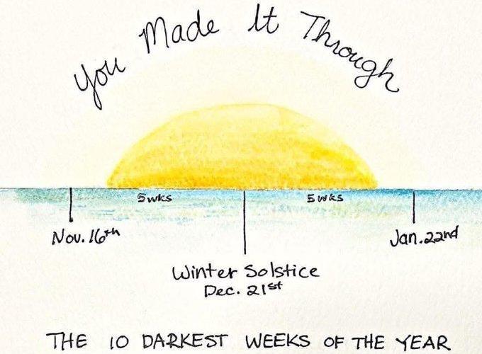
Finally, a diagram that, especially in this Northern Hemisphere season, can be readily applied to many a sales cycle. Let's also make it onto those sunlit uplands, with winning graphics of our own hey.