Deadlock Mapping
A coin-toss clean sweep. Knife-edge landslide. Who saw that coming? The just-completed US Presidential campaign seems to have delivered plenty of gasps all-round. One arena pertinent to us though, is in the visuals.
Beyond the sloganising vibes/joy/brat or ᴍᴀɢᴀ 2.0 slants. Into graphical representation of projections, status and results.
Here's six samples from the past week to give ideas for propelling our own charting.
We saw 'the return of the infamous NYT needle'. A live predictive gauge ran on the tally page of said New York news org. Given its own icon.
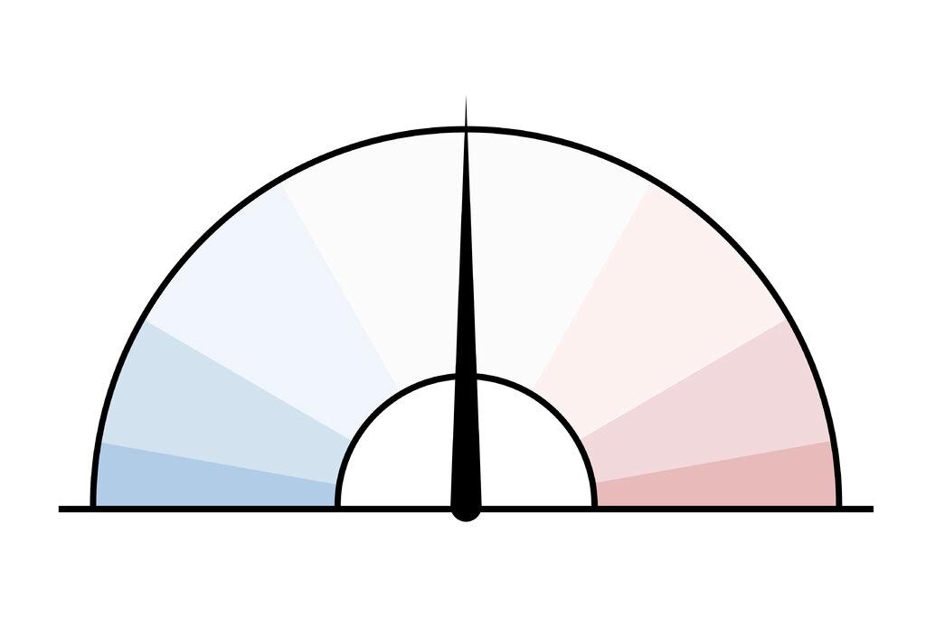
With this snapshot taken as count night drew to a close.

Such -ometers have long been standard dashboard fare. Yet I can't remember seeing one used well for what seems like ages on-screen.
For data, the idea of a range is neat here. Note how the two above differ. The left from Zero to One. The right swinging from twelve o'clock.
They're also great for putting up the blank. Then asking the audience where they plot, sit or would aspire to be on it. Where do they draw their needle?
The Daily Mail used this version of a stacked bar to see who was passing the winning line.
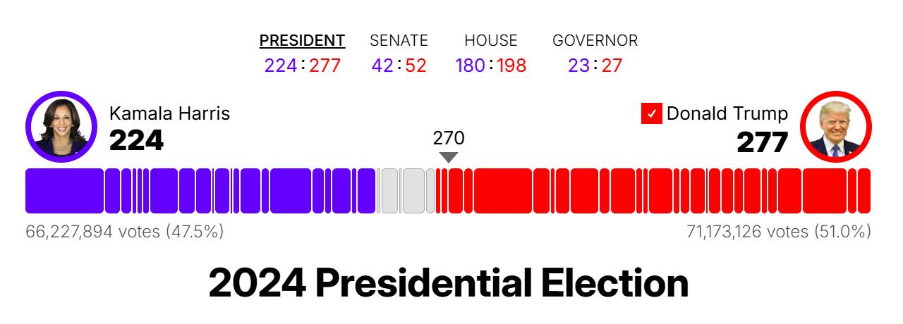
With London-based The Telegraph listing each state and where they're at with a device I've long liked. A set of bricks. With extra 'axis' of flip denoted by the diagonal hatching. Others used a full, darker shade for this.

Going more granular, here's the shifts in preference of but one ethnic group's predominant areas, from London's Times.
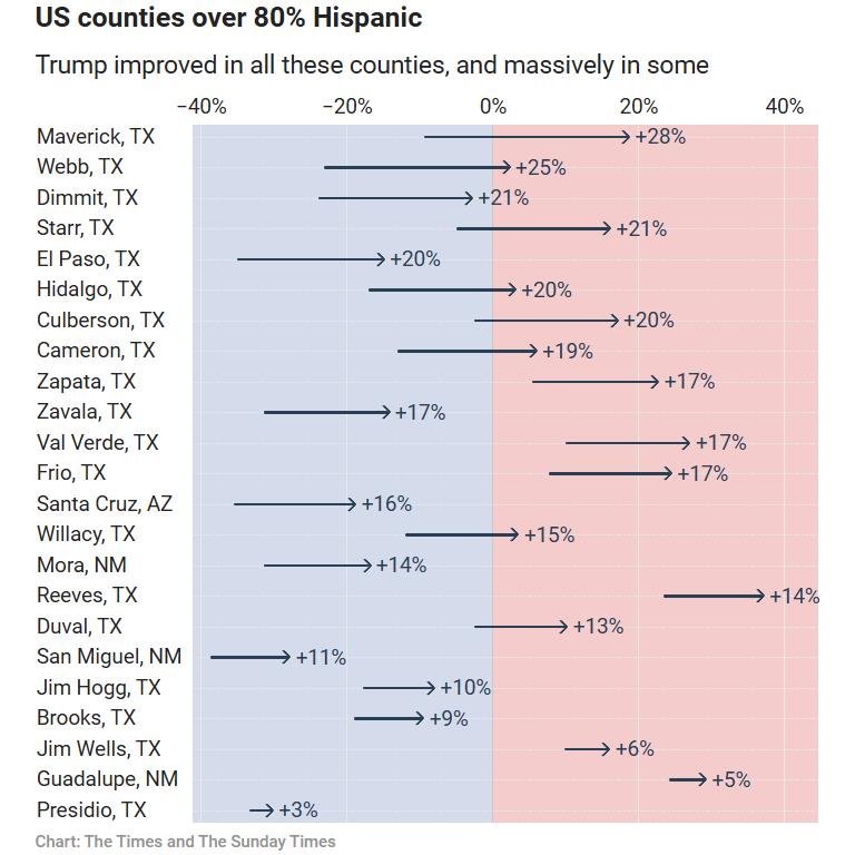
A motioning design take on dumb-bell charts.
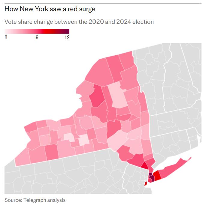
We also saw a plethora of cartograms. I'm quite partial to a choropleth. Here's one from the same graphics team as above of New York state. Its counties tonally red showing their scale of movement from incumbent party to challenger.
Rounding these picks off, the empty map.
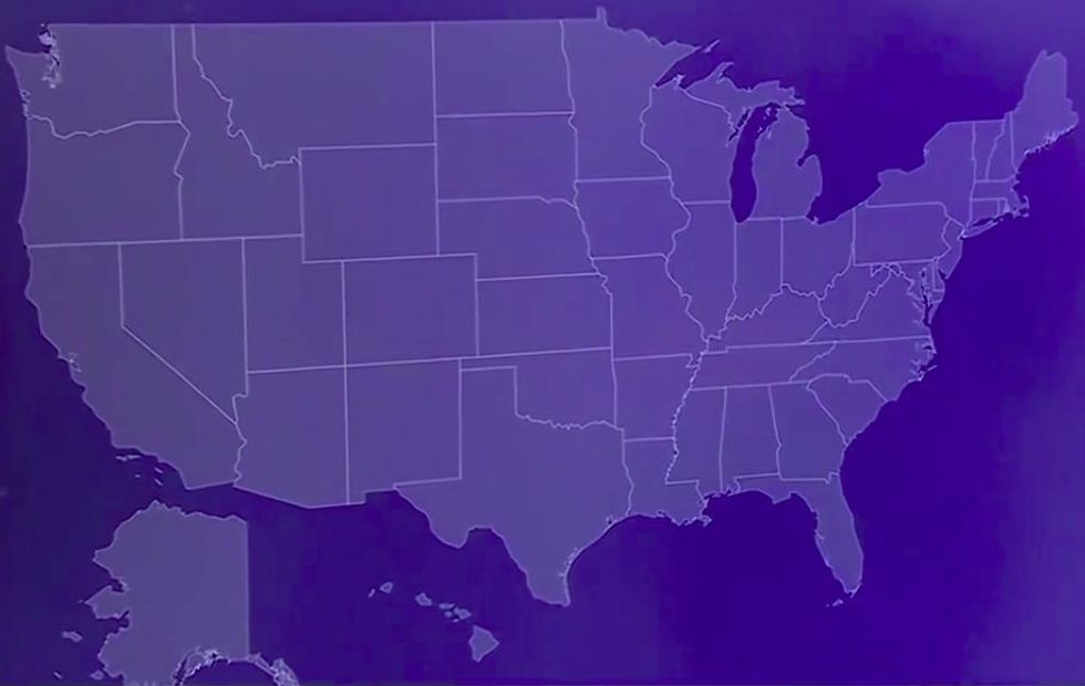
A technique that can have terrific jolting recall. As in this case on live rolling news telly. Albeit the now famed "holy smokes" response of CNN anchor Jake Tapper to stats guy John King comes from slight misinterpretation.
It shows states where the incumbent party candidate outperformed their previously triumphant 2020 stablemate, by three percentage points.
Nowhere. Although such is clearly a tricky task for anyone, at any time.
The point remains valid that if you have a sparse performance, the blank map can be a good place to start. Opening eyes and minds to the scale and severity of your message.
