Don't Worry About Rockstar Pie Chart Colours
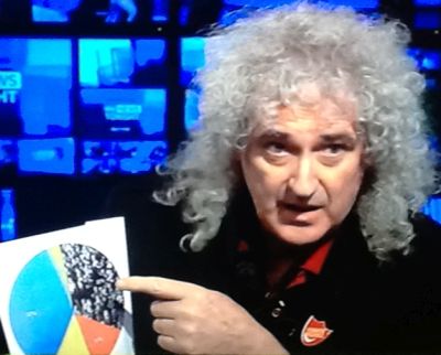
This is Brian May. Once multi-platinum, stadium-filling guitarist of rock legends Queen. Today an astronomer doctorate and environmental campaigner for badgers.
He now has a new cause. Common Decency aims to mobilise all those seemingly disenfranchised to go out and vote next time.
When pitching on telly, he began, “let me pull out my pie-chart”.
His immediate follow on, “don’t worry about the colours”.
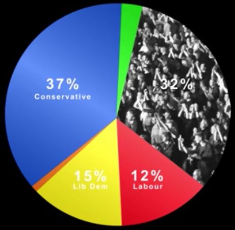
For the next sixty seconds he brandished his printout. His main point was that those top-right, the silent many, in this particular constituency result from the last general election, amounted to 32 percent of the electorate.
Imagine the impact they could have had. He said gleefully. The clear inference being he hoped the blue slice would shrink.
Still, despite using the near-primary colours of the main three parties, he continually referenced the segment he wanted us to zone in on.
It was the greyest. Filled with an anonymous crowd of people.
At least he knew where his focus was.
It did occur to me that if colours weren’t relevant, then why use them?
I also wondered why he’d chosen a relatively scruffy pie.
The tool of choice for pollsters tends to be akin to a bump chart. Line plots that track movements in percentage share over time.
Yet for a definitive snapshot in time, such as the actual election day provides, his pie does work.
In the UK, you don’t need a ‘half-plus-one’ vote tally to win. Merely to be the largest single number of votes. In a multi-party system this can mean small shares win big. Wikipedia lists a 1992 MP elected on as little as a 26% share of the vote.
May’s angle began with a kind of ‘look how large the non-voting proportion is’. Implying that any vote could affect change. So get up and mark your ‘x’.
He knew what the wanted the audience to remember.
Have a look at your latest pie. Does it do the same?
His figures are taken from Chancellor George Osbourne’s seat. “Chosen at random”. It’s not a marginal, yet can be “turned upside down”. Where’s Bowie when you need him…
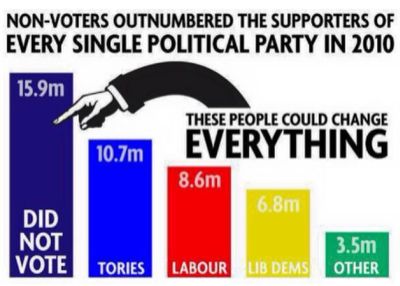
Update … and as an addition from later in the month, I came across this representation, much reposted across Instagram, Pythonesque chartjunk and all;


