Dr No Treatment
Bond. I was so relieved the reviews of the latest outing are good.
In keeping with the 50-year old money printing franchise, the hype is loudly building ahead of Skyfall’s release.
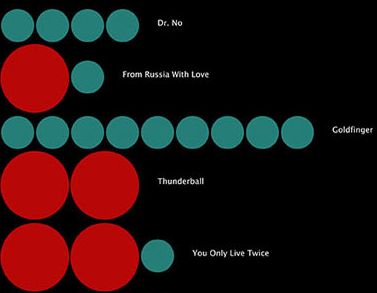
One such article looked at how many kills 007 made across each of the 22 movies.
They used graphics inspired by the first film’s opening credits.
Rather striking. Wherever you have a data set with two different ‘subsets’, applying the same thinking to this is surely a winner.
For instance, here they use the bigger red circle to indicate ten killings, the smaller blue-green, a single slaying. But they could have changed the representation. Why not distinguish between henchmen and super-baddie? Gunshots against any other cause of death? Bond girls versus the rest?
When I first saw this I was thinking of graphing (a new) product sales split out by type of campaign. In my case it was whether a certain pre-sale action had been undertaken. But it could apply to anything, pulling out a specific competitor against the rest, length of bid time, volumes. The list is endless.
Your graphic would certainly stand out compared to a stacked-bar approach. And anyone can pop a circle onto powerpoint, right…

