High Speed Rail Journey Time Saving Charts
Peacetime infrastructure projects in the UK over the past century have typically been an utter shambles.
An embarrassment of vast cost over-runs, white elephants, needless planning delays and errors, obviously misplaced or absent vision and myopic nimby-ism.
England seeks to end this mockery with a so called brand new high speed rail system (HS2). Spreading up from London to second city Birmingham then north beyond. Given the (eventual) success of the only high speed line currently in existence (dramatically reduced journey times at only a twenty percent ticket premium) between the Channel Tunnel and London, the fact those pitching the project also chose to gloss over the enhanced capacity provided was a sorely missed trick.
Still, here we are now, with £10bn a year earmarked for each of the next decade. Over £300m a mile, detractors wail, by the way.
February 2020 saw a stop/go government review recommend the “green signal”.
Of interest from a solution sales perspective, is how mainstream media’s graphics teams depicted the propounded journey time savings.
Yet even when comparing the old with the projected new – a construct we constantly must present ourselves – there’s quite the range deployed.
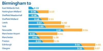
Many went for a straight-forward barchart treatment. The detail is not as important as the themes. These first trio used their ‘new’, saving bar in the shape of a bullet train too;
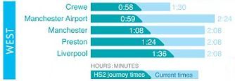
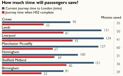
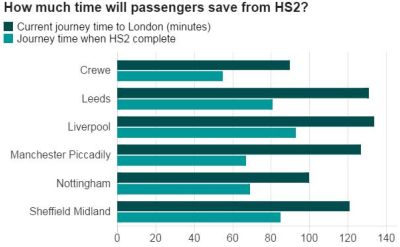
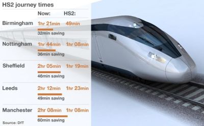
Although standard sideways bars did feature, as with this pair from The Times (kudos for their separate column highlighting actual minutes saved) & BBC;
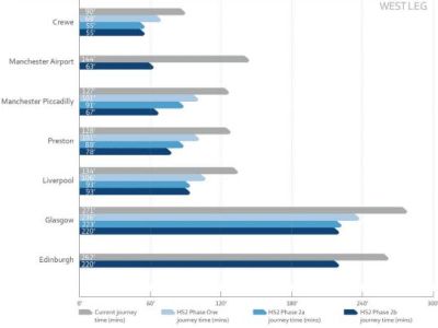
Which makes a standard, stand-up barchart perhaps look a touch bizarre;
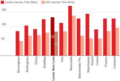
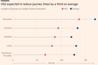
Then there’s another slant on the stacked bar vibe, here from the Guardian & FT;
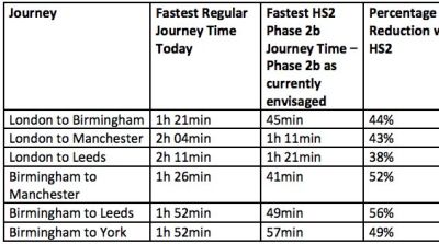
Before remembering the teachings of among others, Stephen Few, with this twitter user posting a data table;
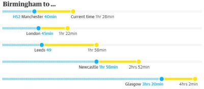
Finally, there’s a trio of infographic slide style treatments too:
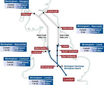
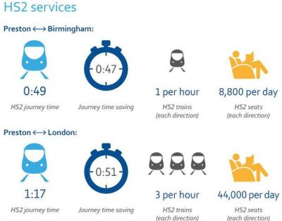
The train pic is on a style standard of the BBC news website. An actual map always entertaining. And hats off to a Preston native, with maybe the best overall slide idea combining time saved with capacity gained.
Plenty of pointers for how you might want to present your precious savings enabled.
Honourable mention also to the FT from May 2019. They bemoaned the £4.3bn spent to that date, without a single yard of track yet laid. The good old tree map, billiondollarogram style often works well on a 4:3 sized slide, way better than say, a piechart;
