Lever Time Magazine Person Of The Year Covers Impact
Time Magazine always garner much publicity around their Person of the Year.
And 2014 is no exception.
Their choice of everyone that provides aid in the current West African Ebola zone also allows me a quick non-instagrammed presentation post.
What struck me about their choice of displaying their selection was the idea that you can get away from the single image.
Often I deploy just one stark picture for a slide.
Anything more can just get to look messy. As well as distracting from your message ‘punch’.
Whilst single photos are usually best, here’s where you can change things up a touch.
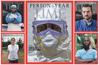
Time use five magazine covers here. The central one is iconic, in the sense of the hazmat suited mask wearer. With the surrounding quartet of health worker portraits in their downtime.
This appears ideal. It combines several elements such as highlighting the many people – as opposed to individual person – they accolade and successfully mixes full photos with protective kit.
The stark contrasting (red atop white) borders also help the visual.
It’s a relatively simple effect to recreate.
Where you’ve a main image, but still feel you have worthy associated ones, this approach can be a cracker.
And if you’ve a succession of single image slides, then using this kind of technique once in among them could add extra bang to a particular key message.