National Convention 24s
These quadrennial American party conferences can be quite the timestamp.
Showing where we're at with the mass glitzy presentation.
They always seemed to me following on behind the latest big arena pop extravaganza staging.
We're a long way on from a simple lectern on raised platform in front of tall curtain.
Nowadays, for instance, there's omnipresent jumbo screens.
The two competing sides of the American horseshoe were though slightly deviating in approach this year.
I think it's fair to say one dialled up the razzmatazz a touch more. Although in the land where there seem to be no 'floating voters' up for grabs can it really be the case that convention optics matter less this year?
In any event, what might we take from these no doubt heavily expensed presentation settings?
First, let's compare the close-ups.
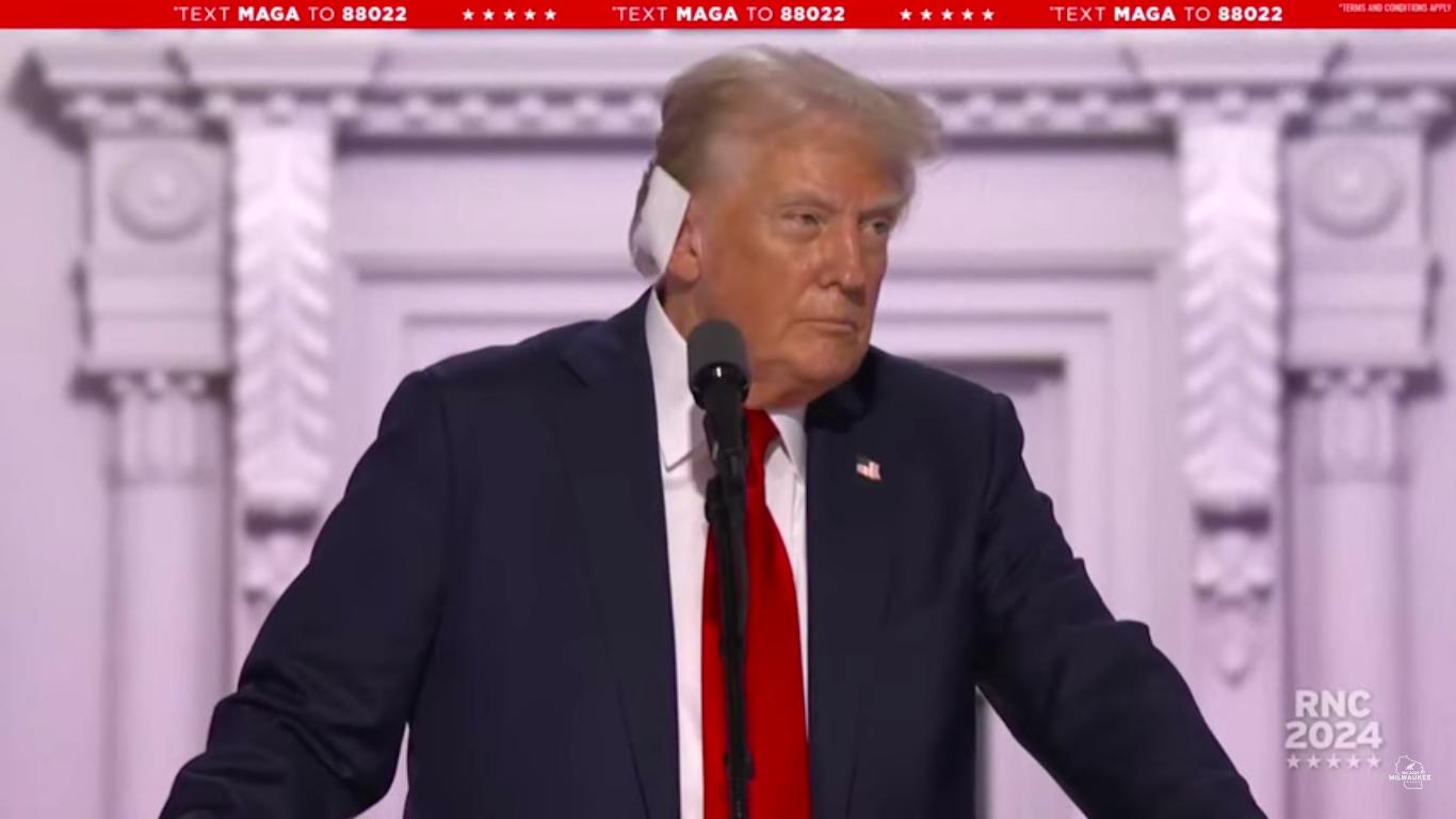
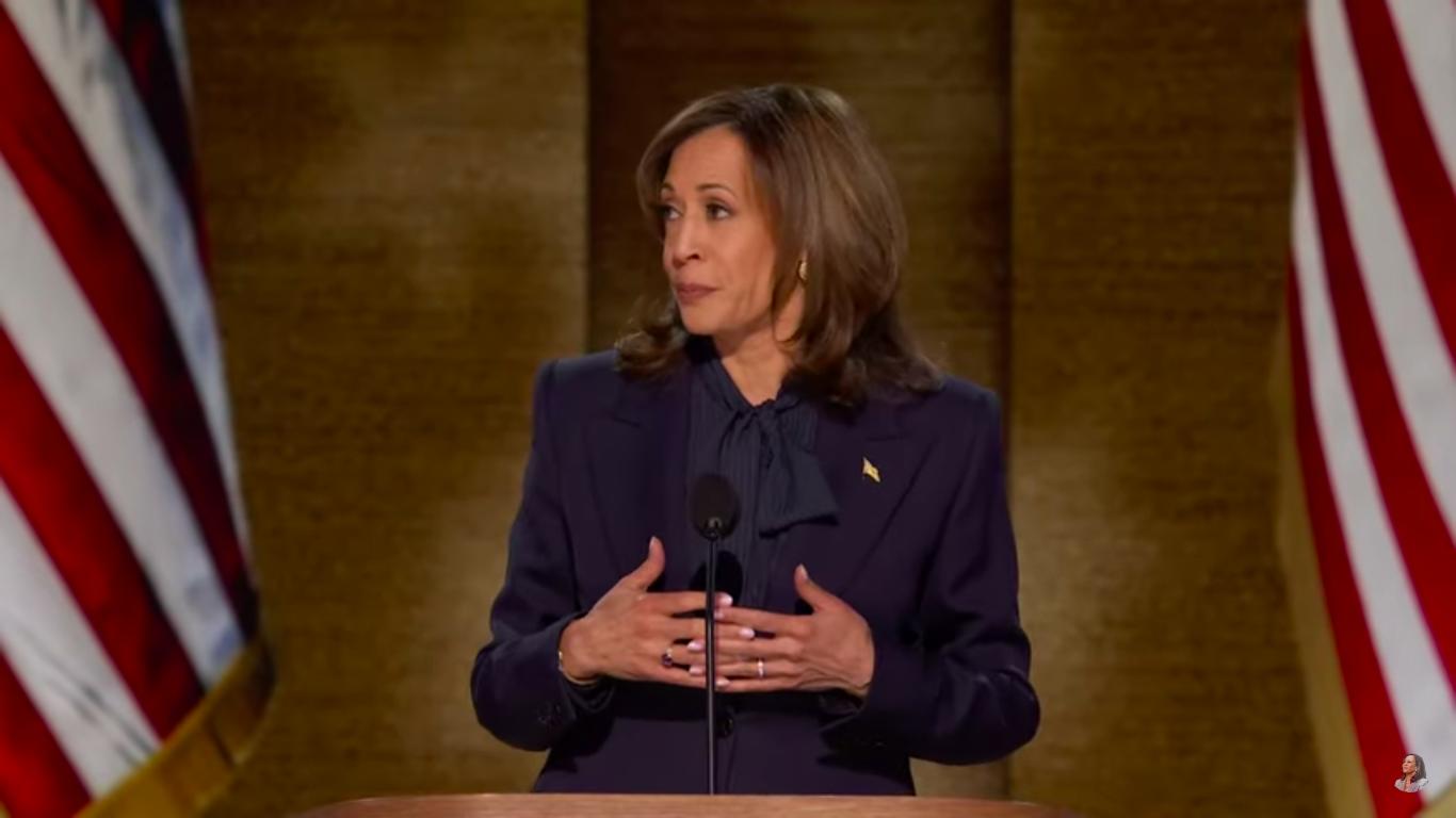
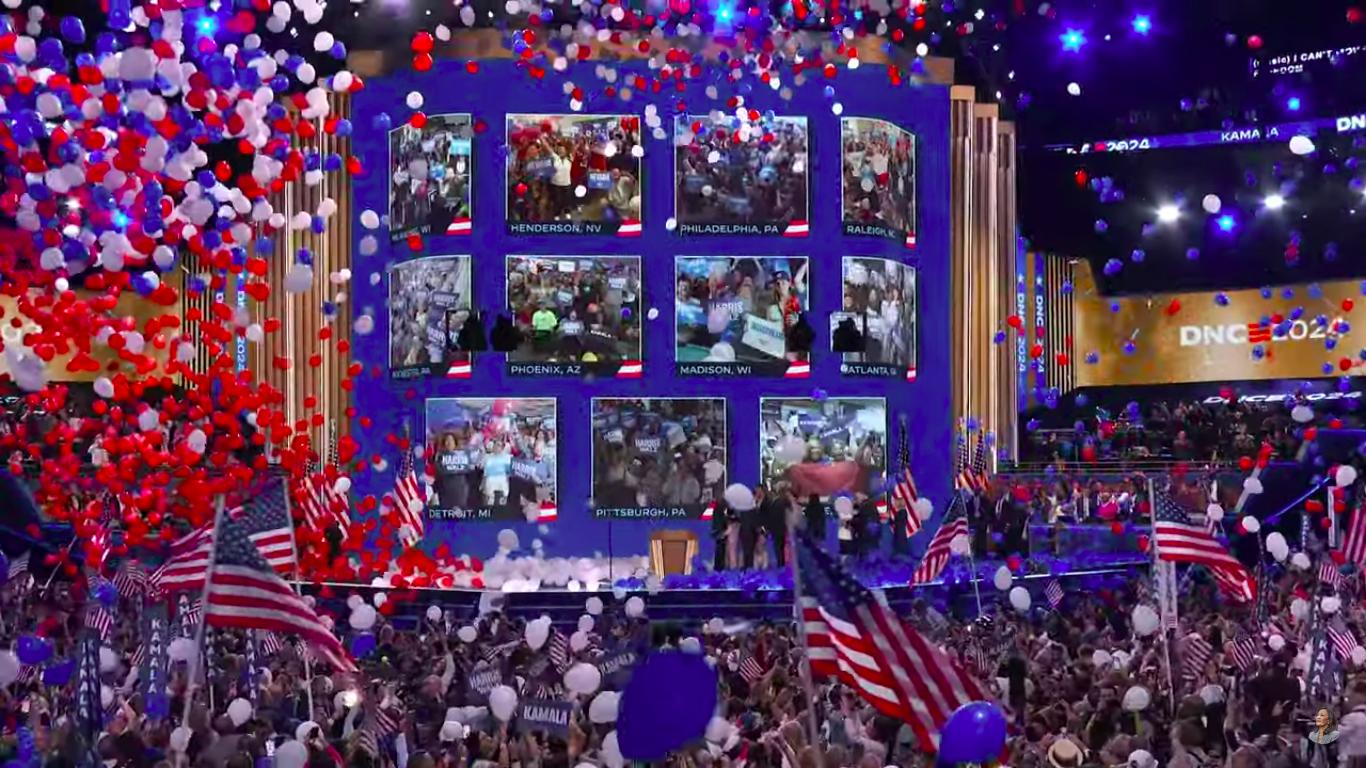
The view that gets seen the longest, throughout various recurring, brief intercut snaps of their adoring masses.
This feels a bit like how we might agonise over our virtual zoom background.
One's brighter. Also showing an (the 'target') identifiable building behind. The other deliberately making the scene akin to a more states-like address.
They differ too in how the wider stage projects.
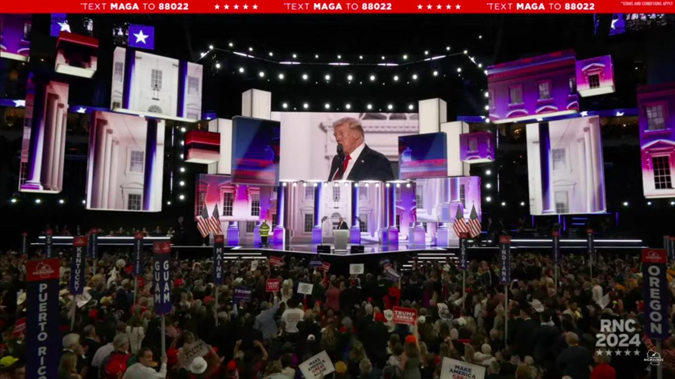
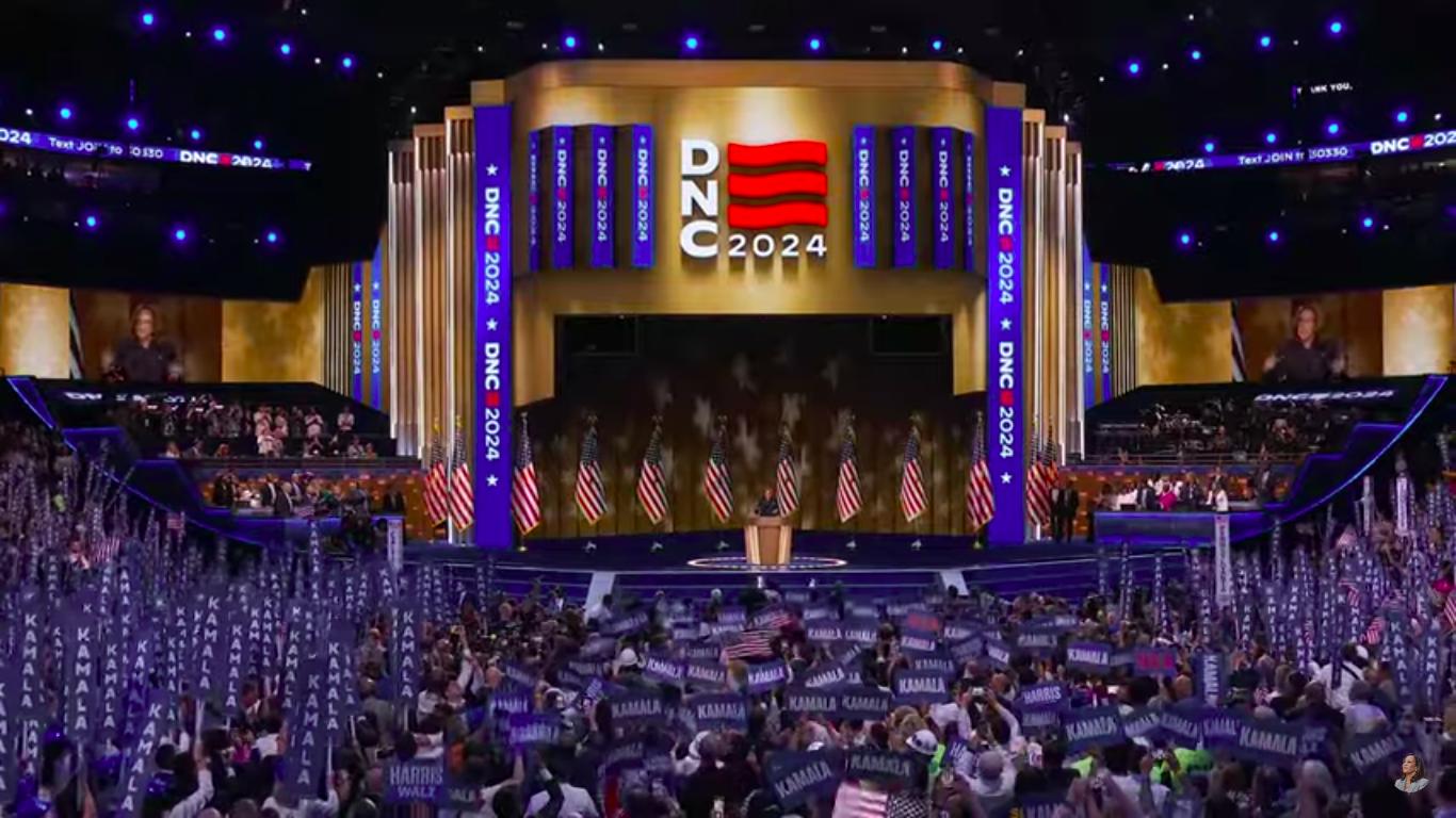
Their pano shots emitting different vibes.
The latter definitely had the fuller approach to supporter placards. Swamping the crowd with plentiful and several different designs to hold up as directed. The lollipop signs above a particular favourite.
I've never seen such treatment when either a sales presenter adheres to 'dress the room', nor to augment a zoomscape. Using the vertical rather than horizontal of the frieze styling f0r reinforcement.
There's almost the same screen area. You prefer the multi-layered approach above or the understated one below?
Whichever, the perhaps biggest impact from either was when the former produced their by now famous 'immigration side that saved my life' and their 'fight fight fight' image.
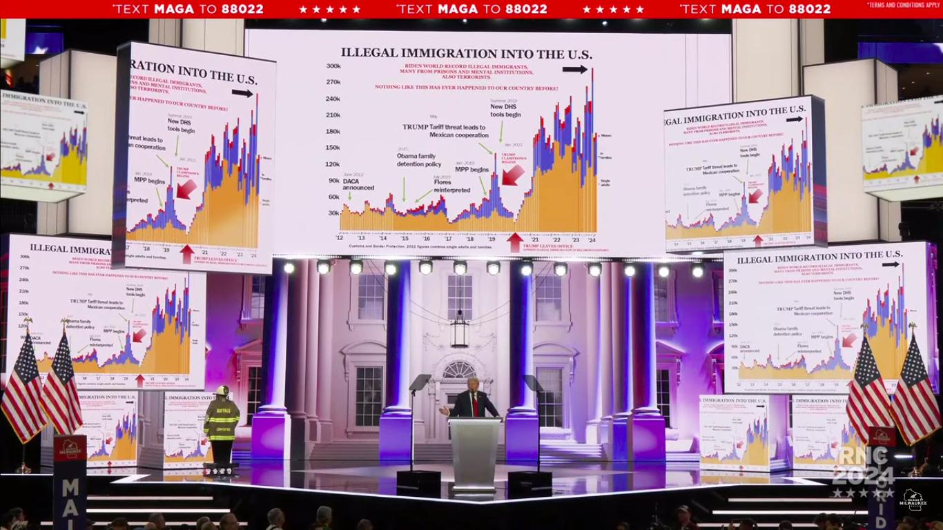
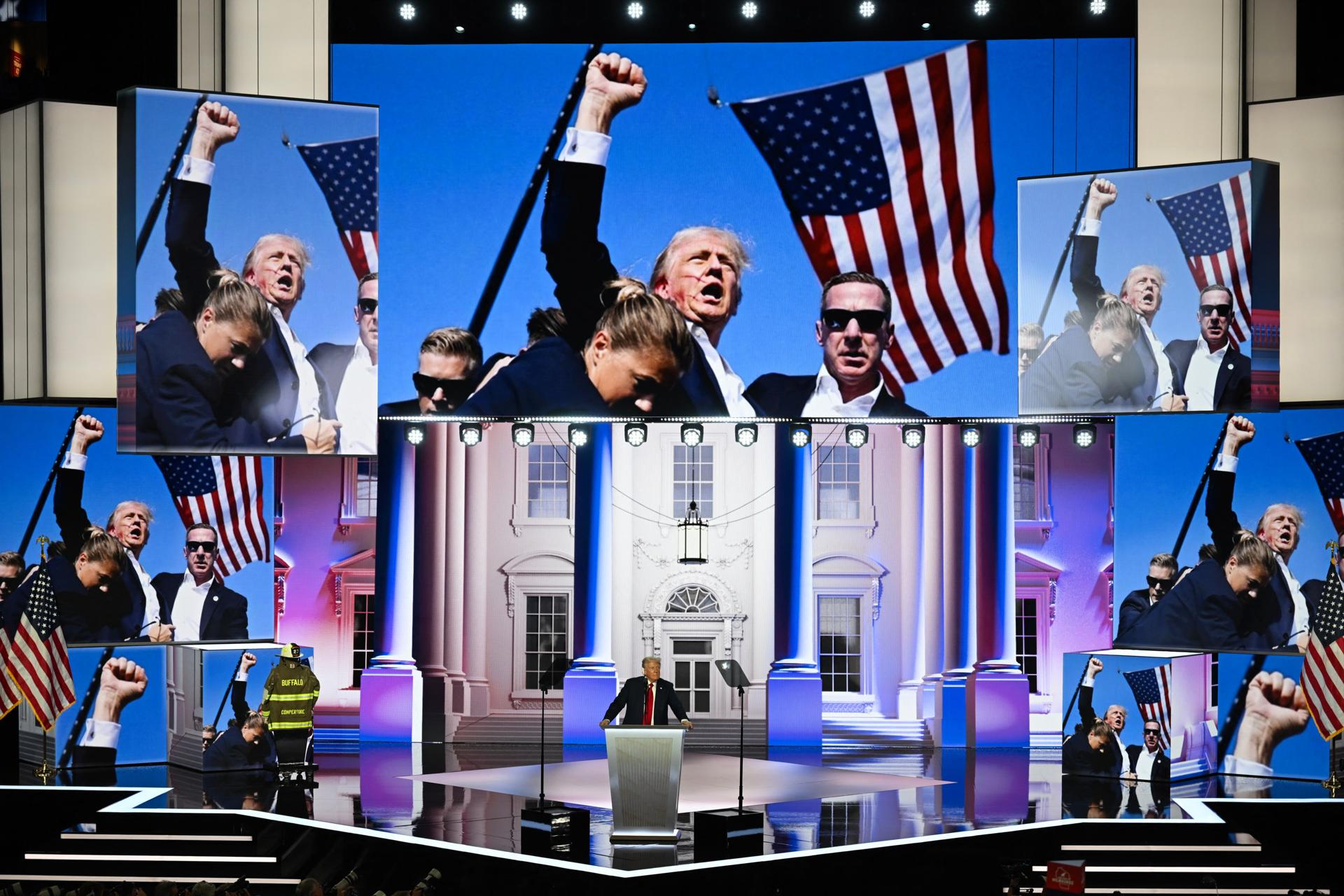
Although overboard for our use, the data well and truly trumped by the message.
Finally, the finale. Balloons.
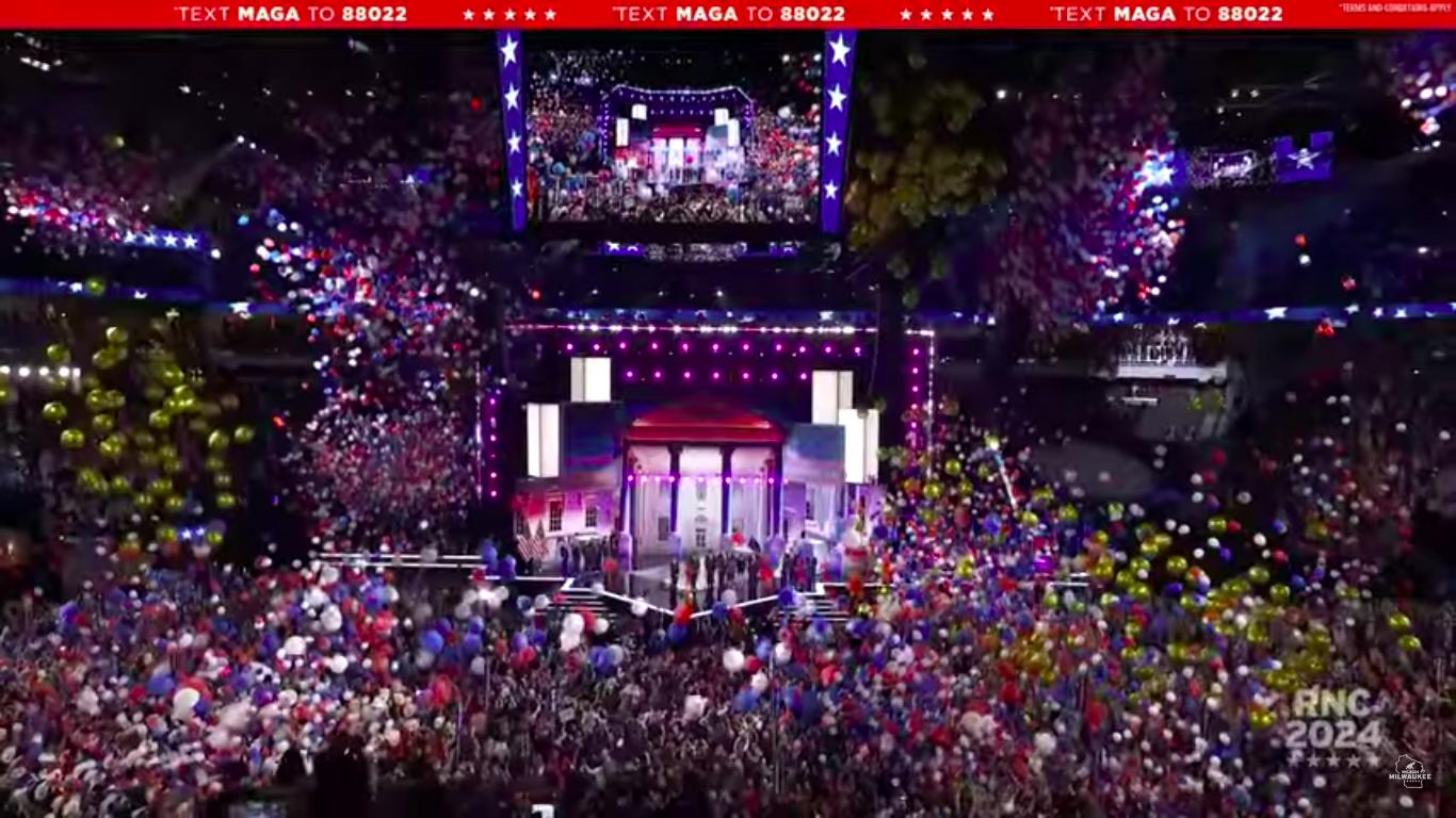
Was a touch surprised the first one added extra yellowy ones (and not orange, say).
And perhaps frustrating to see the full screen utilised in the latter only at this point.
Overall, there's worthy reminders to consider what's behind you when speaking, as well as what your audience is seeing that surrounds you, with a nod to the type of image you're wishing to portray.
And relax, there's no balloons required.