Newsbar Pie Alternative
With rolling news on in the kitchen background tonight, I caught various supposed luminaries state what should happen after chemical warfare emerged in Syria.
The HD channels have for a while maxed out every inch of screen real estate. All sorts of wonderful extras now add colour and flavour to their squared talking head busts, otherwise stranded awkwardly in the middle of a vast landscaped screen.
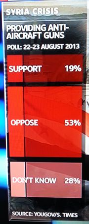
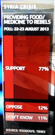
I blogged recently about an interesting alternative to the tired old pie-chart. And courtesy of Skynews above, here’s another.
They presented findings from a public opinion survey about what aid could be provided. Each question had the three usual choices. Yes, No or cop-out Maybe. Specifically in this case; Support, Oppose or Don’t know.
Given the long, tall space to fill on the right hand of their screen, they eschewed the traditional pie. In its place, was this adaptation of a stacked-bar.
It’s a good idea which works well. Helped by the neat use of tonal reds too.
In this way, the main story of each is easily seen. The two most popular views are clear.
This treatment is fairly straightforward in Powerpoint. You just need to get to grips with applying ‘transparency’ to a shape.
Tones of a colour could add a dramatic tinge to your presentation. And be easy to choose given the lurking presence of any corporate brand police.
And it probably holds true that it works best when there is only two or three figures, like the trio they have here.
Another useful alternative to spicing up the standard pie presentation.
I’d like to try a slight change next time this idea is relevant for a prez of mine. I reckon the percentages would look better in the left-hand full block of colour. With the text pushed opposite along the right-edge in the translucent block.


