Number Slide When Headline Guaranteed
Our latest estimates show around 606,000 more people came to the UK than left in 2022:
— Office for National Statistics (ONS) (@ONS) May 25, 2023
▪️ total long-term immigration was around 1.2 million
▪️ emigration was 557,000
➡️ https://t.co/04Rbgiv12v pic.twitter.com/H4ne9A3f3p
UK media worked itself up into a frenzy in the run-up to the announcement of these latest annual net migration figures.
A guaranteed headline for the astonishing numbers freshly welcomed. The debate about overwhelmed public services and infrastructure, and those that help provide them that might actually care about their provision, let alone work at pace, with pride and aplomb when delivering them, raging. All while five million in the country are out of work, on benefits. As advertised vacancies number around 1¼million. Not to mention that housebuilding stalls.
Such unprecedented banner arrivals also shows a rise from the previous year's half-a-million. Although those swelling the ranks were trailed - in what now smells of expectation management spin - at a bottom-end of 700,000, right up to a full-on One Million. Phew, hey.
Regardless of any politics, all in all a presentation slide the makers of which knew would see blanket coverage across the country's media.
Which when you realise this garners the intriguing pickle; how to design such a slide?
Particularly pertinent should we hold that one special number we also know would, or at least want to, mould that lasting impression. Launching discussion that sees its topic take top spot above all other items.
Well, firstly here, they have a few corporate slide backgrounds. Where the 'slice' can fall between the two tones of colour used can vary. Here, it curves nicely between bottom-right author namecheck and the rest.
Said 'colour' also being one of several to hand. Mainly refined takes on secondary colours. Their palette can be seen in the barcharts they use on their linked-to article.
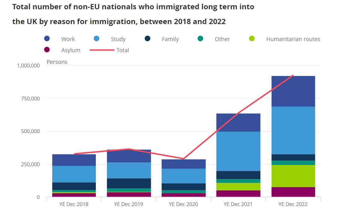
Note on this sample how they choose to use a possibly redundant linegraph for double measure. A highlight of something, maybe?
So for our Big Fig., maybe a simple, sole brand (or brand-aligned) tonal match can suffice too.
Then there's the contrast.
The Number, writ large, up top.
With two elements of explanatory, contextual text separated underneath, in descending font size. Source at foot even smaller.
As for their colours, white for text always fine on a darker backdrop.
That pink though, feels a winner.
Almost unexpected. Striking. And I'd venture, memorable in such light.
Interestingly, there's also text that Twitter offers from their ALT button;
Image description:
606,000
more people came to the UK than left in the year ending December 2022 Publication: Long-term international migration, provisional: year ending December 2022
Something else to consider should you be using slide notes as part of a broader deck.
A final curiosity involves the grammar.
Normally when delivering a metric - such statement with a quantifying feature - the number would best be placed at the end. Akin to SVO in linguistic typology; subject-object-verb. Where the impact is 'full stop'. The last thing to reverberate, the integer. 'Boom'. 💥
Here, that convention is upended.
Yet it works.
The sentence still split three ways. (Maybe a new kind of SVO; score-vitals-o'clock? Anyway...) Their sum total comes first, what it represents next, then time period date-stamp last.
Something for us to riff on in our sphere.