Olympian World Map
It’s a map!! #ParisOlympics #ClosingCeremony pic.twitter.com/a1zc8tw0uH
— NBC Olympics & Paralympics (@NBCOlympics) August 11, 2024
Catch the ponderous, overlong, disjointed and inferior sound quality of this year's Olympic closing ceremony.
There were thankfully the odd decent moment or two. Yet too few and far between to justify three hours.
And to be satisfyingly jingoistic, London 2012 was better, right?!
Anyway, I did like the world map shaped stage. Although I've railed before how ridiculous the Mercator projection is. Worse, swathes of land mass are wilfully omitted in Paris. The Kiwis loud among those nations duly enraged.
Yet with the Paralympics next up, there's a couple of months windows where you might be able to use the IOC template to your advantage.
I took some screenshots to remix and played with their perspective.
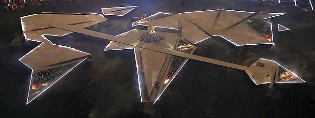
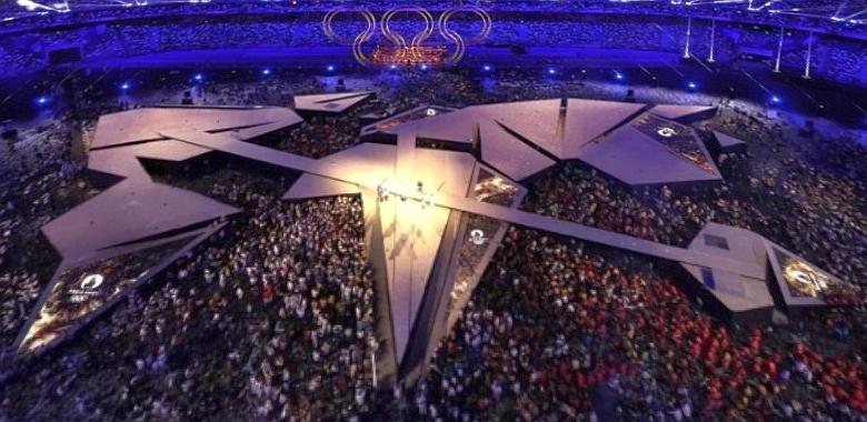
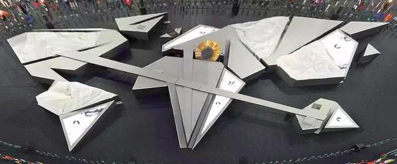
Onto their unflattened earth you can annotate any manner of locations to jolt a hopefully memorable change-up from the typically expected slideware map.