Pitiful Prism Powerpoint
We’ve just had one of those rare days when a powerpoint slide adorns the front of most of the world’s free press.
Apparently the Americans have been trying to police the planet again. This time, according to the lefty papers, in doing so they’ve really become Bond villains and “bypassed democracy”.
Their cyber snooping arm even has a Bondesque baddie handle; prism.
Alas, this outfit display some of the worst contemporary powerpoint abilities you could fear to see.
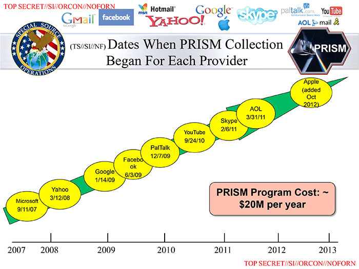
When I first saw the slides I could hardly believe they were so bad. Then, after a quick surf, I was comforted to read I was not alone. In this delicious Huffington Post piece for instance, I found a welcome kindred spirit.
Here’s one of the 41 slides that garnered much sniggering ire.
The blanket opinion is of course spot on. This is appalling powerpoint. No buyer would entrust themselves to any vendor displaying such limited skills today. It does indeed look like the last reading matter of its creator was a ‘slides for dummies’ style book from over two decades ago.
But rather than stop at similarly berating the easy target, I thought I’d see if I could do any better.
I gave myself what I thought a tough, yet reasonable, deadline.
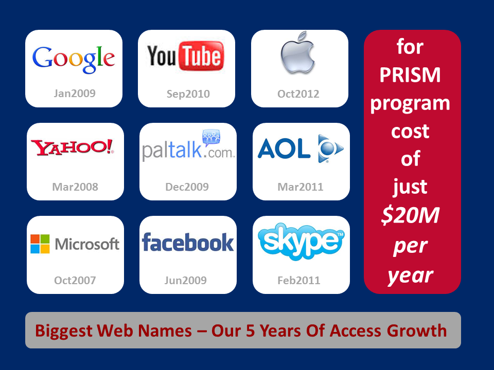
Whilst having live Champions Trophy cricket on from England, I set myself 30 minutes. Here’s where I got. (Click for larger image).
Well. The beauty of real world presentations is that you could sleep on it and refine before any ‘big day’. And as soon as my half-hour was up I thought up plenty of changes and improvements. Still, I’ll come to them later. First, here was a breakdown of my process.
Theme
As with any slide, I spent a good slice of time upfront thinking of the optimum design. The five minutes spent probably isn’t enough under normal circumstances, but as I’d quickly realised the point I wanted to make, it just about worked.
My main visual impact was that I wanted the logos to smack the eyes. The viewer should realise straight away that all the big boys had opened their doors. Then I wanted to re-state the supplemental point, that it was a snip at just twenty million bucks.
I was anxious not to show the logos in the haphazard manner so beloved these days of sales presenters. No different sizes, no quirky angles. I went for uniformity. And I was helped by their being a neat number; nine makes for a pleasing 3×3 matrix.
Colours
So before this, I changed the background. Never a fan of the white when another colour could add much needed gravitas, distinction, and allow for a theme to develop throughout the deck, I knew immediately I wanted the American flag colours as my scheme. Yet this held me up a lot. It took me over five minutes to find the right colour codes for their “old glory” hues.
Template
Getting the box sizes to fit took a while. At least another five minutes. Now I was over half-way through and was worried about my timing.
Images
Thankfully, grabbing the logos was speedy. Mainly because Google images now seems to push the best logo for you atop their results when you suffix the word ‘logo’ to your search. Copy and paste was simple, same for the crop, position and resize of each.
Notations
Then it was simply a matter of tapping in the date of each behemoth’s complicity and copying and editing each in the right slot. Simpler as I’d arranged the logos up and across from bottom-left to top-right. I chose an unobtrusive grey for the font as I didn’t really think it was wildly relevant who came on board when.
Straps
And finally, the two boxes of text. I decided to stick the headline at the foot. Trendy, I know, as the message isn’t really the header. And I’d already designed the space free at the right for the moola comment.
So there you have it, 30 minutes right on the dot. Phew!
Of course, afterwards I would normally take a bit of time away before tweaking.
In this case, I’m happy enough that this particular treatment works as an overall concept, but now…
As for tweaks to this. I never checked whether swapping colours around worked better. Also I feel the logos must be bigger. I’m also not sold on the right-hand text. I could make that brasher. And there’s no real need for the footer to be as big, releasing space and not diverting from the £20M part. (I’d definitely like to mull over a punchy re-write).
I would like to have a bash at a totally different concept too. This is the kind of thing so befitting internet memes and crowdsourced creation. But in my next try, I’d focus massively on just the logos with a single headline emblazoned across them all.
Finally, in my brief reading on this subject, I’m not sure who authored the original. But if it was the whistleblower himself, then I hope Edward Snowden showed elsewhere that he was worth his eye-popping $200k salary, as a piece of work like this I’m afraid doesn’t quite do so… which gets you thinking… in what light does your slidework show your salary?
As a footnote, after I posted this, I got happily alerted to others thinking along my lines. Graphic design at Slate came up with this:
Whilst another effort showed up too from Emiland De Cubber;
I’m far from a graphic designer of course. As a humble rep, I’m focused on the sales message, naturally. Yet they’re both clearly an improvement. Although I don’t recommend repeated headers/footers/logos/titles though, which the first riffers use. And they’ve minimised the logos, which I’m not too sure about. The blue one has some terrific ideas (…am I a bit weird yearning for an extra colour?). Icons rather than full logos, that’s a winner. Shame they don’t make a clear point with text though (his treatment of totally separate slide for the 20mil is a great way to go). And the question headline’s well worth pursuing, isn’t it; Good Snoops for $20M?


