Post-Race Telemetry Graph
Has Formula One motor racing suddenly become interesting?
For once there's competition for world champion. Which one hopes won't be decided in controversial, underhand, non-track manner of the last close contest.
The era's leading team is being usurped.
Creating a buzz around the grid all too rarely seen these days.
At last weekend's Mexico Grand Prix the reigning champ, never shy over a spot of skullduggery, got penalised twice for barging his challenger off the road.
Of Sales note for us, is the scene captured across social media posts. A seemingly impromptu press conference in the immediate aftermath of the race.
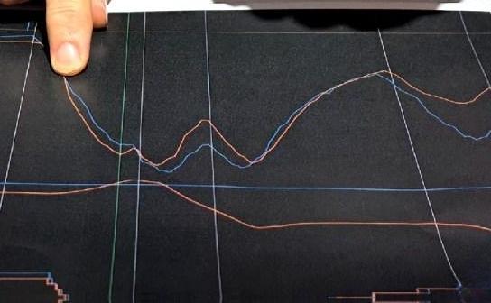
The affected team principal decided to flaunt a linegraph as prop. To show how his charge was unfairly treated for his supposed first offence.
These are people with support resource which barely, if indeed any salesteam can call upon. Yet here was simply a printed page.
From the many versions capturing his aid, here's a zoom-in.

There's plenty to take from this deployment.
Perhaps as foundation, he actually had such prop. A printout. A chart that tells your side. Allows you to weave a story. One that jolts, sticks and keeps traction. Gaining you coverage bringing potentially the sympathy for and empathy with your cause that you seek.
Consider the actual graph. What does it mean? The point is not immediately apparent. Does that matter? Is the storytelling all part of the process to win hearts and minds? The fact that such telemetry data in visual form may be out-of-the-ordinary to so many can mean it makes a deeper impression.
Then there's the depiction. Those straight white lines. The two colours of wiggles (one for each driver of the incident, matching each team's livery). Other strange, unreferred to, redundant lines.
Could the main pair be thicker? Would any highlight technique be better than finger pointing? Might an extra zoomed spotlight of the core data element be a hammer to knock home your nail?
And the black background. Possibly the best subliminal trick of the lot. A proven great way to stand out is not to default to white.
At the very least, this world title winning team leader had his chart to hand. Have you got yours?
Christian Horner has turned up with graphs to illustrate Lando Norris attempted a divebomb around the outside of Max Verstappen.
— Elizabeth Blackstock (@eliz_blackstock) October 27, 2024
Red Bull isn't pursuing a right of review, but a clarifying of the rulebook.
cc @Planet_F1 pic.twitter.com/xXxyVZXlAo
One other tip. He deliberately chose physical form. Not using say a tablet. Know the time when this approach works so well. In both virtual and in-person forums. As it's almost always.

