Red Tory, Blue Labour
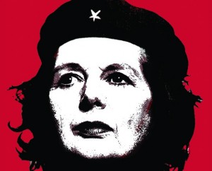
Relax, this isn’t a post for political anoraks. I never had much time for Ché myself mind you.
My post’s title refers to the latest emerging trends from the UK’s two main parties. You’d be forgiven for thinking that they espouse the same thing. You see, each party’s normal colour is swapped for the other’s. So on the face of it, are they simply trying to capture the vital middle-ground, the unresolved issues over which those undecided between the two grapple, allowing the crucial swing vote to float their way?
I came across these movements after listening to a radio doc on my way home about Blue Labour (transcription here). Searching out Red Tory ideas to spot the difference, I was understandably frustrated at how in typically elitist fashion both sides fail to get their point across in decent language. Luckily some observers clear the mud.
Anyway, as much I loved the trains of thought triggered by such concepts from a sales perspective – like to stem the tide of transactional interaction to rather seek relational ones, that the ‘golden age’ is in the future rather than Arcadian or Merrie England and that Marx surprisingly left us with one good quote, “it’s always too late and it’s never too late” – the use of colour intrigued me the most.
In this case, it seems a pretty obvious ploy to woo back the disaffected who had switched by saying, ‘we fixed why you deserted us, you can come back now’.


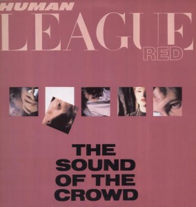
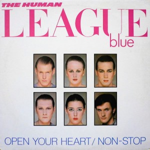
The radical music of my youth turned space age sounds from computer keyboards mainstream. A genre defining and game changing album was 1981’s Dare from The Human League. For a short while in that cycle, the band used the addition of colour to describe tracks. Human League Red was ‘dance’, Human League Blue was ‘pop’. (Wikipedia also quotes them as saying that Red was for ‘new romantics’, Blue was for Abba fans). For any synthpoppers out there, here’s a Blue tune.
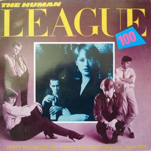
One possible reason for this trick to be short-lived was perhaps that, even to hardcore fans, the distinction was slightly baffling. Surely all the band’s songs at this stage were basically ‘dance-pop’? After all, their biggest global mega-smash, Don’t You Want Me, was taglined Human League 100, with the design having the 100 featuring both blue and red colours.

A more obvious demarcation would be ballad or dance. Or as George Michael decided on his first greatest hits, ‘for the heart’ and ‘for the feet’. Still there is an interesting construct inside here.
I believe that every sales initiative needs a project name. It creates personality. It can reinforce a culture. It encapsulates a movement to get behind.
A colour can help greatly in this regard.
Thankfully, any typical associations with a chosen colour need not cloud issues. For instance red can relate to the removal of clutter in the form of ‘axing red tape’, and blue can relate to the removal of clutter as in ‘creating clear skies’.
What’s important is that the team involved attribute traits and the colour that, to them, represents these. This has the twin benefit of making your pitch easier to get across to prospects as well them being more likely to remember it.

