Show Your Key Number The Basecamp Way
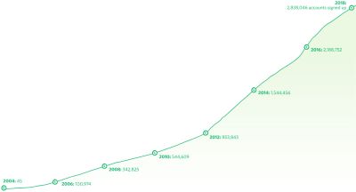
The detail of this chart above isn’t that important.
It shows biannual growth in users of an old favourite anti-project management ‘app’. Before the word app meant what it means today.
Fourteen years in and they’ve nearly three million “accounts signed up”.
It adds up to impressive monthly subscription revenue.
What strikes me is where this line graph is positioned.
It emerges large at the very foot of each webpage.
They’ve incorporated it into the space where you typically get a mini menu tree, contact details and social media links.
They deem it their prime selling ‘metric’. The one set of figures they feel will most appeal to those wishing to sign up.
Which draws the clear comparison; what would yours be?
And how are you presenting it?
footnote: I’ve blogged fondly on these guys’ approach over the years. Here’s a selection:
tech business handbook, Getting Real
long-time blog, signal versus noise
visuals on customer satisfaction
proposal ‘yes’ page