Slidedeck Bonfyre

Glamping now so ordinary. Try a luxury festival in the Bahamas. Or not. Given the disaster that was this weekend’s Fyre Festival.
Widely reported, relief tents and cheese sarnies greeted astonished revellers. Which caused much mocking for the wildly expensive shindig that appears to have gone spectacularly wrong. “Disruption everywhere, but not the fun startup kind.”
Yet sellers can be thankful for Vanity Fair’s further uncovering of the initial $25m funding pitch 43-slide deck for the “fiasco” labelled as “one of the most preposterous invitations for outside capital that I have ever seen”.
They refer to “deceits”, the worthlessness of ending with a philosopher-poet quote of “seek those who light your flames”, and a $100million lawsuit already in train.
As it is not often a slidedeck makes global news, what can we day-to-day solution sellers take from it?
Vanity Fair select their own “most absurd” 15 of the total 43. There’s certainly plenty of slidewoes to avoid. Which in part is surprising, as pr firm 42 West associated with this I’ve mentioned before and you’d have thought knew better.
Yet looking at the wider canvas, the deck follows none of the best practice such a doc ought to.
Pretty much everything seems askew. Framework, theme, filters. Purpose, personals, priorities.
There is an attempt to outline ‘problem’, ‘vision’ and in the shape of the slide up-top, ’cause’. But they can still all be both meaningless and incorrectly labelled. Why should “reimagined” be so desirable above worldclass, niche or simply functioningly good?
You see too the purpose of the doc, as seen with this slide;

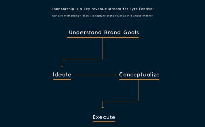
Which provides more questions than answers, and not in a good way at all. Then perhaps the most startling of the business-y slides. If their “360 methodology” doesn’t ring alarm bells loud enough, they then hit you with “ideate”;

