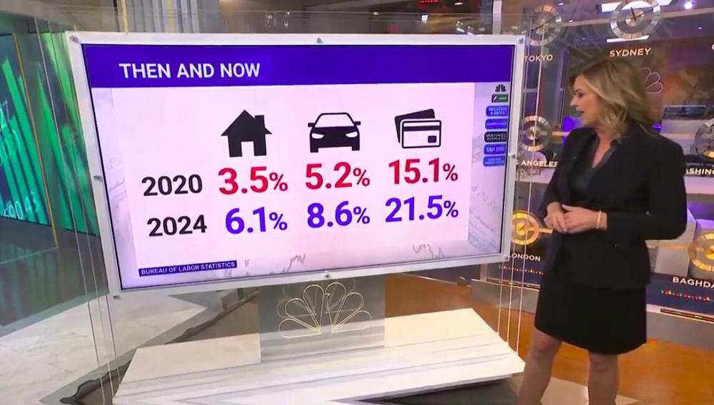
Then And Now Slide
Edward Tufte would be proud. A trailblazer in how to present data. Among his many guideline presentation concepts, he cited his Magic Number.
This related to when you ought use a numeric table, or a chart.
I often see a presentation slide with a graphic when nicely listed numbers would have been better.
The above struck me as an example of this.
Its context was around the latest American central bank decision on interest rates.
Imagine this data in another form. Whether linegraph, barchart or any other, the impact, understanding and message of these numbers would not have been anywhere near as good.
20.
That's the advised dataviz magic number. For numbers amounting to fewer, a numeric table is your method.
Here, there's six.
There's also other such magicals.
George Miller's famed "7 +/- 2". Relating to how many 'units of information' can be processed.
As well as the 'four perceptual units in one panel' limit.
Yet return to the slide up top.
It makes for a winning template. Adaptable to many a selling scenario. And in your slideware of choice, simple to swap out their day-to-day icons for ours, or even client logos or product branding.
Then And Now.