TOS-DR
Here’s an interesting site I came across. Its mission;
“I have read and agree to the Terms” is the biggest lie on the web. We aim to fix that.
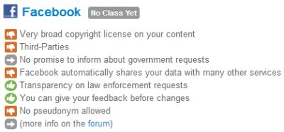
They trawl through each web service provider’s terms and conditions, and strip out what you need to know. Then categorise the relevant major points in a helpful manner. Here’s their current take on Facebook as an example.
By way of reference, here’s their key to the symbols;
I think you can use and adapt this approach to both show the differences between different quote options to a prospect, and internally to highlight competitive differences and edges.
They use shades of greens through amber to reds, with grey for info.
From a design view, if you have one main corporate colour, I’d be tempted to use that for the ‘green’ shades, and migrate to greys/blacks for the more negative reds, with info as a neutral, complimentary to your corporate colour, hue.
This treatment would make a neat slide in a deck, as well as a more informative proposal quote explanation page.
When it comes to proposal content, I can imagine this sweetly distinguishing your quote from anyone elses. A final punch is that I expect it’d also help to persuade buyers beyond the baseline, bottom level of investment.


