What Could Hospital Rounds And Your Pipeline Share?
One breakfast-time background early Jan I caught a tv piece from an English hospital ward.
Assembled healthworkers were filmed having their regular morning meeting.
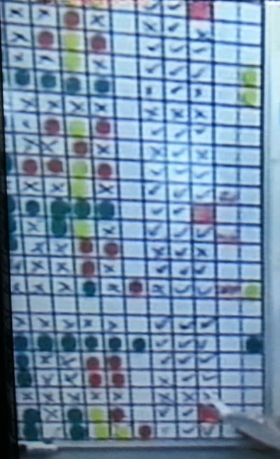
They were gathered around this whiteboard.
My hastily taken screenshots are too blurry for detail, yet they show the general idea.
The graphic appears to highlight status. Where patients are at, and what must happen next.
Progress is designated by combination of coloured tags, ticks and crosses.
I’m immediately drawn to individual sales process.
For all deals you have committed to spend time on, can you see at a glance where you’re at with them?
And where they need your focus today?
These kinds of visuals are a great way of really getting on top of your forecast.
Show you’re in control.
The easiest place to start would be to think of the few things – there need only be half-dozen or so to start – that when they take place, you to win.
If you’re one of the all too rare salespeople that cultivate your own sustainable, repeatable winning process, then you’ll already know them.
If you work for a corporate that puts your process in the concrete of one of the major sales system vendors, then you could use some of those that happen to be accurate for you.
Pop your prospects down the left, then in each column across have one of your pointers.
Think of what occurs each time you gain a signature.
Here’s some generic examples;
- the CEO tells you you’re in
- you have access to whoever you want
- your prospect has documented something to you
- the decision method is transparent
- a particular competitor is also bidding
- you started the whole purchase train
- your post-sale team really hit it off with the key clientside people
- tacit acceptance of payback
There’s several to dig for.
Then you can work out how to record how you fare against each criteria.
Colours, number scale, yes or no, percentage. Anything that shows straight away the health of your pipeline.
Footnotes from elsewhere around the NHS. First, a glimpse of the Accident and Emergency status screen. This was deliberately blurred by the broadcaster so as to protect privacy. But you’ll see how colour exists. These highlight urgency. Specifically patients in danger of going over the 4-hr target for maximum waiting times.
As a final extra, we also gained a peak inside the telephone diagnosis system for their 111 helpline.
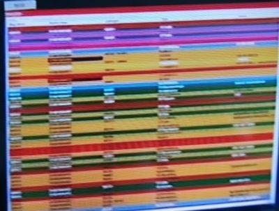
Another blurry pic, but again enough to get an idea.
This screen shows all the current received calls.
The colour denotes the importance. Purple apparently being most needy. Green an all-clear.
Billions wasted on IT and this is what’s delivered. I’m sure you can do better…